Our first SNA case study is guided by the work of Matthew Pittinsky and Brian V. Carolan (2008), which employed a social network perspective to examine teachers’ perceptions of student friendships agreed with their own. Sadly, this excellent study did not include any visual depictions comparing student and teacher perceived friendship networks, but we are going to fix that!
Our primary aim for this case study is to gain some hands-on experience with essential R packages and functions for SNA. We learn how to preparing network data for analysis and creating a simple network sociogram to help describe visually what our network “looks like.” Specifically, this case study will cover the following topics pertaining to each data-intensive workflow process (Krumm, Means, and Bienkowski 2018):
Prepare: Prior to analysis, we’ll look at the context from which our data came, formulate some research questions, and get introduced the {tidygraph} and {ggraph} packages for analyzing and visualizing relational data.
Wrangle: In the wrangling section of our case study, we will learn some basic techniques for manipulating, cleaning, transforming, and merging network data.
Explore: With our network data tidied, we learn to calculate some key network measures and to illustrate some of these stats through network visualization.
Model: We conclude our analysis by introducing community detection algorithms for identifying groups and revisiting sentiment about the common core.
Communicate: We develop a polished sociogram to highlight key findings.
1a. Review the Research
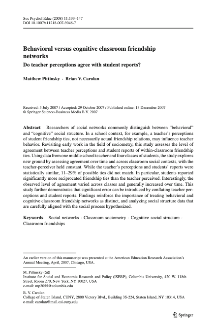
Pittinsky, M., & Carolan, B. V. (2008). Behavioral versus cognitive classroom friendship networks. Social Psychology of Education, 11(2), 133-147.
Abstract
Researchers of social networks commonly distinguish between “behavioral” and “cognitive” social structure. In a school context, for example, a teacher’s perceptions of student friendship ties, not necessarily actual friendship relations, may influence teacher behavior. Revisiting early work in the field of sociometry, this study assesses the level of agreement between teacher perceptions and student reports of within-classroom friendship ties. Using data from one middle school teacher and four classes of students, the study explores new ground by assessing agreement over time and across classroom social contexts, with the teacher-perceiver held constant. While the teacher’s perceptions and students’ reports were statistically similar, 11–29% of possible ties did not match. In particular, students reported significantly more reciprocated friendship ties than the teacher perceived. Interestingly, the observed level of agreement varied across classes and generally increased over time. This study further demonstrates that significant error can be introduced by conflating teacher perceptions and student reports. Findings reinforce the importance of treating behavioral and cognitive classroom friendship networks as distinct, and analyzing social structure data that are carefully aligned with the social process hypothesized.
Research Questions
The central question guiding this investigation was:
Do student reports agree with teacher perceptions when it comes to classroom friendship ties and with what consequences for commonly used social network measures?
We will be using this question to guide our own analysis of the classroom friendships reported by teachers. Specifically, we will use the first part of this question to guide our analysis and develop two sociograms to help visually compare similarities and differences between teacher and student reported classroom friendships.
Data Collection
To measure the level of agreement between student and teacher reports of classroom student friendships, sociometric data were collected from each student in all four classes and the teacher provided similar reports on all students. To collect student reports of friendships, students were given a class roster and asked to describe their relationship with each student in the class. Choices included best friend, friend, know-like, know, know-dislike, strongly dislike, and do not know. In the terminology of network analysis, these sociometric data are “valued” (degrees of friendship, not just yes or no) and “directed” (friendship nominations were not presumed to be reciprocal). Data were collected in the autumn and spring. All “best friend” and “friend” choices are coded as ‘1’ (friend), while all other choices are coded as ‘0’ (not friend). The teacher’s reports of students’ friendships were generated in a similar manner.
Analyses
To assess agreement between perceived friendship by the teacher and students, QAP (quadratic assignment procedure) correlations for each class’s two matrices (teacher and student generated) were analyzed in the autumn and spring. A QAP correlation is used to calculate the degree of association between two sets of relations; it tests whether the probability of dyad overlap in the teacher matrix is correlated with the probability of dyad overlap in the student matrix. It does so by running a large number of simulations. These simulations generate random matrices with sizes and value distributions based on the original two matrices being tested. It then computes an average level of correlation between the matrices that would be expected at random. Similarly, it calculates the probability that the observed degree of correlation between two matrices would be as large or as small as that observed based on the range of correlations generated in the random permutations, with an associated significance statistic.
Key Findings
As reported by Pittinsky and Carolan (2008) in their findings section:
While the teacher’s perceptions and students’ reports were statistically similar, 11–29% of possible ties did not match. In particular, students reported significantly more reciprocated friendship ties than the teacher perceived.
❓Question
Based on what you know about networks and the context so far, what other research question(s) might ask we ask in this context that a social network perspective might be able to answer?
A Project is the home for all of the files, images, reports, and code that are used in any given project
Since we are working from an R project cloned from GitHub, a Project has already been set up for you as indicated by the .Rproj file in your main directory in the Files pane. Instead, we will focus on getting our project set up withe the requisite packages we’ll need for analysis.
Packages, or sometimes called libraries, are shareable collections of R code that can contain functions, data, and/or documentation and extend the functionality of R. You can always check to see which packages have already been installed and loaded into RStudio Cloud by looking at the the Files, Plots, & Packages Pane in the lower right-hand corner.
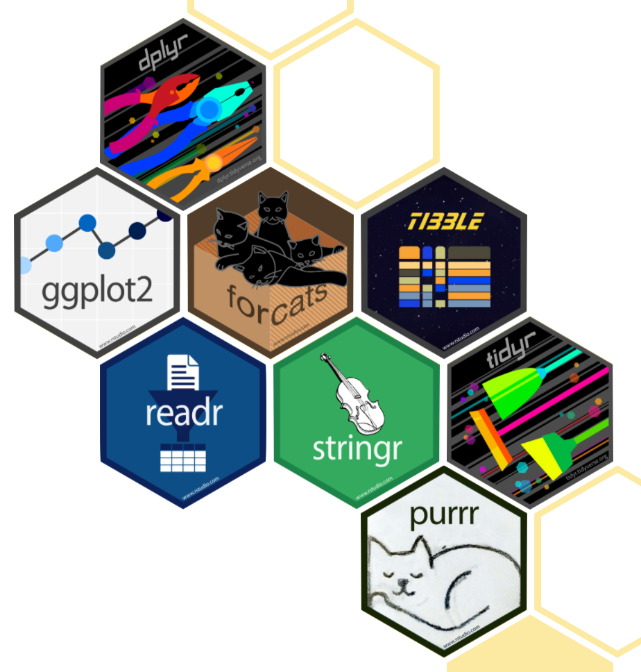
tidyverse 📦
One package that we’ll be using extensively is {tidyverse}. Recall from earlier tutorials that the {tidyverse} package is actually a collection of R packages designed for reading, wrangling, and exploring data and which all share an underlying design philosophy, grammar, and data structures. These shared features are sometimes “tidy data principles.”
Click the green arrow in the right corner of the “code chunk” that follows to load the {tidyverse} library introduced in LA Workflow modules.
library(tidyverse)
── Attaching core tidyverse packages ──────────────────────── tidyverse 2.0.0 ──
✔ dplyr     1.1.4     ✔ readr     2.1.5
✔ forcats   1.0.0     ✔ stringr   1.5.1
✔ ggplot2   3.5.2     ✔ tibble    3.2.1
✔ lubridate 1.9.4     ✔ tidyr     1.3.1
✔ purrr     1.0.4
── Conflicts ────────────────────────────────────────── tidyverse_conflicts() ──
✖ dplyr::filter() masks stats::filter()
✖ dplyr::lag()    masks stats::lag()
ℹ Use the conflicted package (<http://conflicted.r-lib.org/>) to force all conflicts to become errors
Don’t worry if you saw a number of messages: those probably mean that the tidyverse loaded just fine. Any conflicts you may have seen mean that functions in these packages you loaded have the same name as functions in other packages and R will default to function from the last loaded package.
New Packages
Next, we will introduce two new packages that further extend the tidyverse and which we will use throughout the the network analysis modules.
tidygraph 📦
The {tidygraph} package is a huge package that exports 280 different functions and methods, including access to almost all of the dplyr verbs plus a few more, developed for use with relational data. While network data itself is not tidy, it can be envisioned as two tidy tables, one for node data and one for edge data.
The {tidygraph} package provides a way to switch between the two tables and uses dplyr verbs to manipulate them. Furthermore, it provides access to a lot of graph algorithms with return values that facilitate their use in a tidy workflow.
ggraph 📦
Created by the same developer as {tidygraph}, {ggraph} – pronounced gg-raph or g-giraffe hence the logo – is an extension of {ggplot} aimed at supporting relational data structures such as networks, graphs, and trees. Both packages are more modern and widely adopted approaches data visualization in R.
While ggraph builds upon the foundation of ggplot and its API, it comes with its own self-contained set of geoms, facets, etc., as well as adding the concept of layouts to the grammar of graphics, i.e. the “gg” in ggplot and ggraph.
readxl 📦
The {readxl} package makes it easy to get data out of Excel and into R. Compared to many of the existing packages (e.g. gdata, xlsx, xlsReadWrite) readxl has no external dependencies, so it’s easy to install and use on all operating systems. It is designed to work with tabular data.
Since one of our data wrangling steps in the next section is importing network matrices stored in excel files, this package will come in handy.
R Studio Tip: Type ??read_excel into the console and check the arguments section to examine the different arguments that can be used with this function.
👉 Your Turn ⤵
Use the code chunk below load the {tidygraph}, {ggraph}, and {readxl} packages:
# YOUR CODE HERElibrary(tidygraph)
Attaching package: 'tidygraph'
The following object is masked from 'package:stats':

    filter
library(ggraph)library(readxl)
2. WRANGLE
In general, data wrangling involves some combination of cleaning, reshaping, transforming, and merging data (Wickham and Grolemund 2016). As highlighted in Estrellado et al. (2020), wrangling network data can be even more challenging than other data sources since network data often includes variables about both individuals and their relationships.
For our data wrangling in lab 1, we’re keeping it relatively simple since working with relational data is a bit of a departure from our working with rectangular data frames. Our primary goals for Lab 1 is learning how to:
Import Data from Excel. In this section, we learn about the read_xlsx() function for importing network data stored in two common formats: matrices and nodelists.
Make a Tidy Graph. Before we can create our sociogram, we’ll first need to convert our data frames into special data format, an R network tbl_graph object, for working with relational data.
2a. Import Data
One of our primary goals for this case study to is create network graph called a sociogram that visually describes what a network “looks like” from the perspective of both students and their teacher. To do so, we’ll need to import two Excel files originally obtained from the Social Network Analysis and Education companion site. Both files contain edges stored as a matrix and are included in the lab-1 data folder of your R Studio project. A description of each file from the companion website is copied below along with a link to the original file:
99472_ds3.xlsx This adjacency matrix consists of student-reported friendship relations among 27 students in one class in the fall semester. These data are directed and unweighted; a friendship tie is present if the student reported that another was either a best friend or friend.
99472_ds5.xlsx This adjacency matrix consists of the teacher-reported friendship relations among 27 students in one class in the fall semester. These data are directed and unweighted; a friendship tie is present if the teacher reported that students were either a best friend or friend.
Relational data (i.e., information about the relationships among individuals in a network) are sometimes stored as an adjacency matrix. Network data stored as a matrix includes a column and row for each actor in our network and each cell contains information about the tie between each pair of actors, often referred to as edges. In our case, each tie is directed, meaning that relationships between actors may not necessarily be reciprocated. For example, student 1 may report student 2 as a friend, but student 2 may or may not report student 1 as friend. If both student 2 and student 2 indicate each other as friends, then this tie, or edge, is considered reciprocal or mutual.
Import Student-Reported Friendships
Let’s use the read_excel() function to import the student-reported-friends.xlsx file. In our function, we’ll include an important “argument” called col_names = and set it to FALSE. This tells R that our file does not include column names and is important to include since our file is a simple matrix with no header or column names and by default this argument is set to true and would assign the first row which contains data about student friendships as names for each column.
Finally, we need to make sure we can reference the matrix we import and use it later in our analysis. To do so, will save it to our “Environment” by assigning it to a variable which we will call student_friends.
Before importing our teacher-reported friendship file, use the code chunk below to quickly inspect the student_friends data we just imported to see what we’ll be working with.
You should now see a 27 x 27 data table that represents student-reported friendships stored as an adjacency matrix. As noted on pg. 140 of Pittinsky and Carolan (2008), students were given a class roster and asked to describe their relationship with each student using the following choices: best friend, friend, know-like, know, know-dislike, strongly dislike, and do not know. In the terminology of network analysis, these sociometric data are valued (degrees of friendship, not just yes or no).
For the purpose of the their study, and for this case study as well, all “best friend” and “friend” choices are coded as ‘1’ (friend), while all other choices are coded as ‘0’ (not friend). This process of taking a valued relationship or tie (i.e., degrees of friendship, not just yes or no) and simplifying into a binary yes/no relationship is referred to as dichotomization and we’ll explore the benefits and drawbacks of this process in Module 4.
In addition to ties being valued or binary, they can also be undirected or directed. For example, in an undirected network, a friendship either exists between two actors or it does not. In a directed network, one actor or ego may indicate a relationship (e.g., friend or best friend), but the other actor or alter may indicate there is no friendship. If the relationship is present between both actors, however, the tie or edge is considered reciprocated.
❓Question
Provide a brief response in the space below to the following questions: Do the data we just imported indicate that these friendship ties are directed or undirected? How can you tell?
Directed. For example, Student 1 did not indicate that they are friends with Student 3, but Student 3 indicated they are friends with Student 1.
Add Names
R has packages for creating random names to help anonymize data, but to keep things simple, we’ll just assign the numbers 1 through 27 as names for our rows and columns.
rownames(student_friends) <-1:27
Warning: Setting row names on a tibble is deprecated.
colnames(student_friends) <-1:27
You may have seen a warning stating: Setting row names on a tibble is deprecated. You can ignore that for now but it’s basically telling us these functions are old we we need to use newer function or our code will some day stop working.
Again, let quickly inspect our student_friends data table to see if this worked:
Much better! Now we can see that student 1 indicated that student 2 is their friend, and student 2 indicated that student 1 is their friend, so we can say that this friendship is “reciprocated” or “mutual.” As we’ll see in Lab 2, reciprocity is an import network-level measure in SNA.
Import Student Attributes
Before importing our teacher-reported student friendships, we have another important file to import. As noted by Carolan (2014) , most social network analyses include variables that describe the attributes of actors in a network. These attribute variables can be either categorical (e.g., sex, race, etc.) or continuous in nature (e.g., test scores, number of times absent, etc.).
Actor attributes are stored a rectangular array, or data frame, in which rows represent a social entity (e.g., students, staff, schools, etc.), columns represent variables, and cells consist of values on those variables. This file containing a list of actors, or nodes, along with their attributes is sometimes referred to as a node list.
Let’s go ahead and read our node list into R and store as a new object called student_attributes:
# A tibble: 27 × 6
      id name      gender achievement gender_num achievement_num
   <dbl> <chr>     <chr>  <chr>            <dbl>           <dbl>
 1     1 Katherine female high                 1               1
 2     2 James     male   average              0               2
 3     3 Angela    female average              1               2
 4     4 Joseph    male   high                 0               1
 5     5 Samantha  female average              1               2
 6     6 Susan     female average              1               2
 7     7 Anna      female high                 1               1
 8     8 Kimberly  female average              1               2
 9     9 Helen     female high                 1               1
10    10 Samuel    male   low                  0               3
# ℹ 17 more rows
Note that when we imported this time, we left out the col_names = FALSE argument. As mentioned earlier, by default this argument is set to TRUE and assumes the first row of your data frame will contain names of the variables. Since this was indeed the case, we didn’t need to include this argument. We could, however, have included this argument and set it to TRUE and our resulting output would still be the same.
Although an underlying assumption of social network analysis is that social relations are often more important for understanding behaviors and attitudes than attributes related to one’s background (e.g., age, gender, etc.), these attributes often still play an important role in SNA. Specifically attributes can enrich our understanding of networks by adding contextual information about actors and their relations. For example, actor attributes can be used to for:
Community Detection: Identifying groups with shared attributes, revealing substructures within the network.
Homophily Analysis: Examining the tendency for similar individuals to connect, shedding light on social cohesion.
Influence and Diffusion: Understanding how characteristics of individuals affect the spread of information or behaviors.
Centrality Analysis: Correlating attributes with centrality measures to assess individuals’ influence based on their traits.
Network Dynamics: Investigating how changes in attributes correspond to the evolution of network structures.
Statistical Modeling: Incorporating attributes in models to explore the interplay between individual traits and network formation.
Visualization: Enhancing network visualizations by using attributes to differentiate nodes, making patterns more discernible.
We will explore several of these use cases throughout the SNA modules, but for this case study, our focus will be to incorporate some student attributes to enhance our visualizations.
👉 Your Turn ⤵
Complete the code chunk below to import the teacher-reported-friends.xlsx file, add row and column names, and inspect your teacher_friends object.
# YOUR CODE HEREteacher_friends <-read_excel("data/teacher-reported-friends.xlsx", col_names =FALSE)
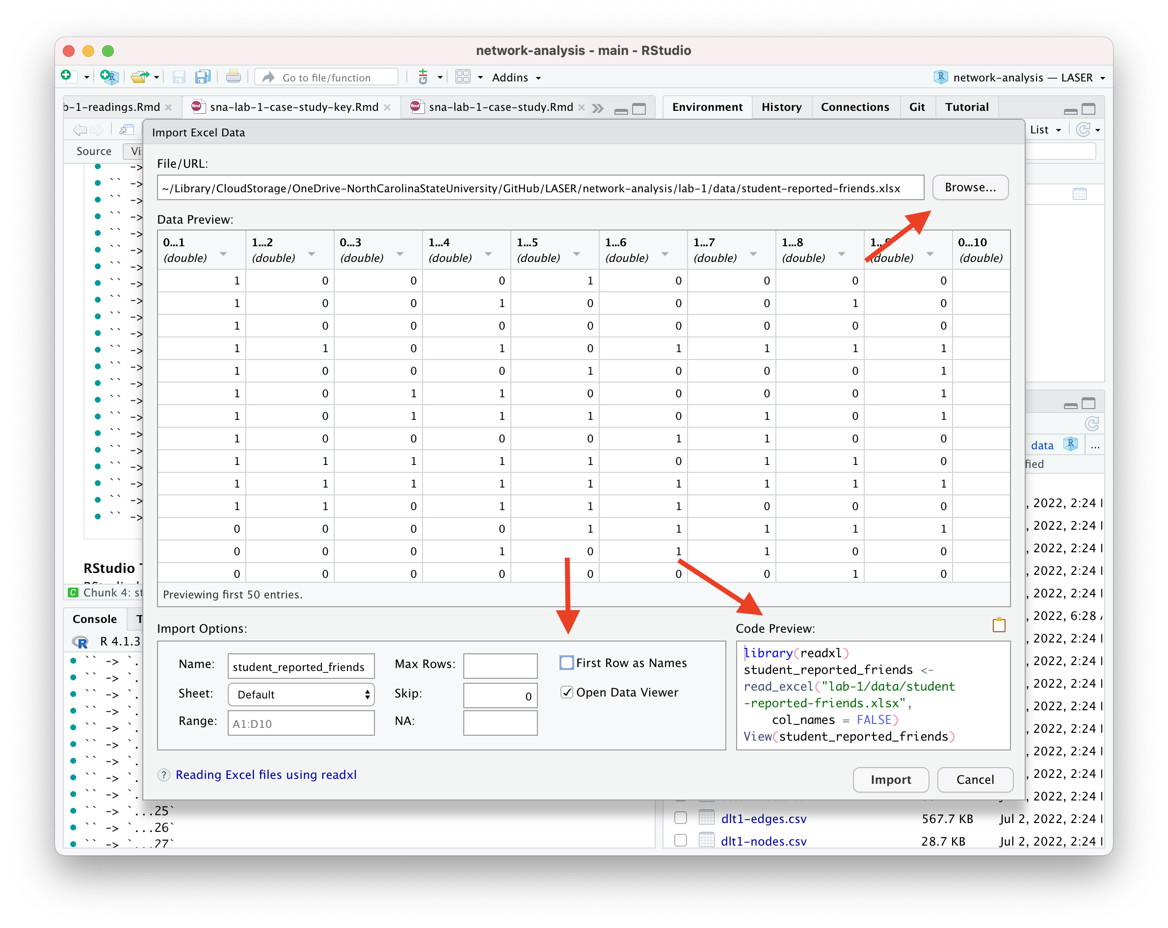
If you happen to run into issues with data import, RStudio has a handy “Import Dataset” feature for a point and click approach to adding data to your environment.
If you want to give this a try, be sure to pay attention to the default settings and the name it will give your data frame when imported. Also be sure to include the R code it generates in your R script or markdown file.
2b. Make a Tidy Graph
Before we can begin exploring our data through through network visualization, we must first restructure our student friendship and attribute data into a single network data structure that contains information about both the nodes and edges in our two data frames. These network data structures can be stored in a several different ways, but we’ll focus on a fairly standard data structures that are used by popular packages such as {igraph}, {tidygraph}, and {ggraph}.
Convert Table to Matrix
You may have noticed in the ouptut above that even though our data is stored in a matrix format in the original file, it was imported as a “tidy” data table, or tibble, which a modern version of a data frame in R. It is designed to be a more user-friendly and efficient alternative to traditional data frames and is the default format used among {tidyverse} packages.
Converting this to a formal matrix is necessary because many graph-related functions in R, particularly those in the igraph and tidygraph packages, require the input data to be in matrix form to properly construct the graph.
Run the following code to convert the student_friends data frame into a matrix and display it below:
Matrices are often necessary for graph-related functions that require formal matrix input, as we’ll see in just a bit.
Before moving on, let’s quickly check the class of our data object just to be sure it is now stored as true matrix:
class(student_friends)
[1] "matrix" "array"
Excellent! We’re now ready to start creating a network graph object, which will eventually contain data from both our student friends file as well as the individual attributes of each student.
Convert to Graph Object
Our final step before we’re able to begin exploring our data is to convert our matrix to a network object recognized by the {tidygraph} and {ggraph} packages.
The as_tbl_graph() general function can easily convert relational data from all common network data formats such as matrices, network, phylo, dendrogram, data.tree, graph, etc.
Let’s run the following code to convert our matrix to directed network graph and save as a new object called student_network. We’ll also include the argument directed = TRUE in our as_tbl_graph() function to indicate that our network is directed.
Now let’s take a quick look at our new student_network object:
student_network
# A tbl_graph: 27 nodes and 203 edges
#
# A directed simple graph with 2 components
#
# Node Data: 27 × 1 (active)
   name
   <chr>
 1 1
 2 2
 3 3
 4 4
 5 5
 6 6
 7 7
 8 8
 9 9
10 10
# ℹ 17 more rows
#
# Edge Data: 203 × 3
   from    to weight
  <int> <int>  <dbl>
1     1     2      1
2     1     4      1
3     1     5      1
# ℹ 200 more rows
As you can see, our student_network object provides a range of information about out network including network size, type, number of components, and a preview of the node and edge lists that it created. The node and edge lists are treated just like a typical data frame and can now be used with other tidyverse packages and functions to create new actor-level network variables like degree, reciprocity, and centrality measures.
What is an edge list?
The node list is a pretty typical format for social science research, we’ve just given it a different name. But what exactly is an edge list?
An edgelist is way to store relational data, or network ties, and commonly used in network analysis. Specifically, the values in the first two columns of each row represent a dyad, or tie between two nodes in a network.
This format is likely very different than other formats you have worked with before. An edge-list can also contain other information regarding the strength, duration, or frequency of the relationship, sometime called weight, in addition to other “edge attributes.”
In directed networks like ours, the first column indicates that student 1 reported students 2, 4, and 5 are friends. Since our network is unweighted, the 1 for “weight” just indicates that a friendship was present. Our data folder also contains a valued adjacency matrix which indicates the “strength” of the relationship or friendship, but we’ll stick with the simpler of the two matrices for now.
Let’s take a closer look at those edges. The {tidygraph} package has a useful activate() function that we will be using extensively throughout the SNA learning labs. This function allows us to work with the nodes and edges in our network object as if they were typical data frames and apply to them the entire suite of {tidyverse} functions for wrangling and summarizing data.
For now, let’s just use the activate() function to single out the edgelist in our network object, use the as_tibble() function to temporarily convert it to a data frame, and use the <- assignment operator to permanently save it in our environment as student_edges.
We’ll also use a very powerful |> operator called a pipe. Pipes are a powerful tool for combining a sequence of functions or processes. The original pipe operator, %>%, comes from the {magrittr} package but all packages in the tidyverse load %>% for you automatically, so you don’t usually load magrittr explicitly.
The pipe has become such a useful and much used operator in R that it is now baked into R using the new and simpler version of the pipe |> operator demonstrated in the following code chunk:
Great! Now we can see the full list of edges in our network ordered by student ids.
More importantly, however, is now that we have our edges stored in a standard format, we can combine our student_edges and student_attributes data frames into a single network object that contains the information from both!!
To do so, we’ll use the more standard tbl_graph() function from the {tidygraph}. First, run the following code to take a look at the help documentation for this function:
?tbl_graph
You probably saw that this particular function takes the following three arguments, two of which are data frames:
edges = A data.frame containing information about the edges in the graph. The terminal nodes of each edge must either be encoded in a to and from column, or be in the two first columns.
nodes = a node list that starts with a column of node IDs. Any following columns are interpreted as node attributes.
node_key = The name of the column in nodes that character represented to and from columns should be matched against.
directed = determines whether or not to create a directed graph.
Now let’s run the following code to specify our ties data frame as the edges of our network, our actors data frame for the vertices of our network and their attributes, and indicate that this is indeed a directed network.
# A tbl_graph: 27 nodes and 203 edges
#
# A directed simple graph with 2 components
#
# Node Data: 27 × 6 (active)
      id name      gender achievement gender_num achievement_num
   <dbl> <chr>     <chr>  <chr>            <dbl>           <dbl>
 1     1 Katherine female high                 1               1
 2     2 James     male   average              0               2
 3     3 Angela    female average              1               2
 4     4 Joseph    male   high                 0               1
 5     5 Samantha  female average              1               2
 6     6 Susan     female average              1               2
 7     7 Anna      female high                 1               1
 8     8 Kimberly  female average              1               2
 9     9 Helen     female high                 1               1
10    10 Samuel    male   low                  0               3
# ℹ 17 more rows
#
# Edge Data: 203 × 3
   from    to weight
  <int> <int>  <dbl>
1     1     2      1
2     1     4      1
3     1     5      1
# ℹ 200 more rows
Much better!! Now we can see that in addition to the edges in our network, our network object now contains information about students’ gender and achievement levels in text and numerical format.
👉 Your Turn ⤵
Complete the code chunk below to convert your teacher_friends object first to a matrix and then to a network object that contains information about both the teacher-reported student friendships and the attributes of students:
# A tbl_graph: 27 nodes and 69 edges
#
# A directed simple graph with 6 components
#
# Node Data: 27 × 6 (active)
      id name      gender achievement gender_num achievement_num
   <dbl> <chr>     <chr>  <chr>            <dbl>           <dbl>
 1     1 Katherine female high                 1               1
 2     2 James     male   average              0               2
 3     3 Angela    female average              1               2
 4     4 Joseph    male   high                 0               1
 5     5 Samantha  female average              1               2
 6     6 Susan     female average              1               2
 7     7 Anna      female high                 1               1
 8     8 Kimberly  female average              1               2
 9     9 Helen     female high                 1               1
10    10 Samuel    male   low                  0               3
# ℹ 17 more rows
#
# Edge Data: 69 × 3
   from    to weight
  <int> <int>  <dbl>
1     1     4      1
2     1    12      1
3     1    27      1
# ℹ 66 more rows
❓Question
Now answer the questions that following questions:
How many students are in our network?
YOUR RESPONSE HERE
Who reported more friendships, teachers or students? How do you know?
YOUR RESPONSE HERE
3. EXPLORE
As noted in our course readings, one of the defining characteristics of the social network perspective is its use of graphic imagery to represent actors and their relations with one another. To emphasize this point, Carolan (2014) reported that:
The visualization of social networks has been a core practice since its foundation more than 100 years ago and remains a hallmark of contemporary social network analysis.
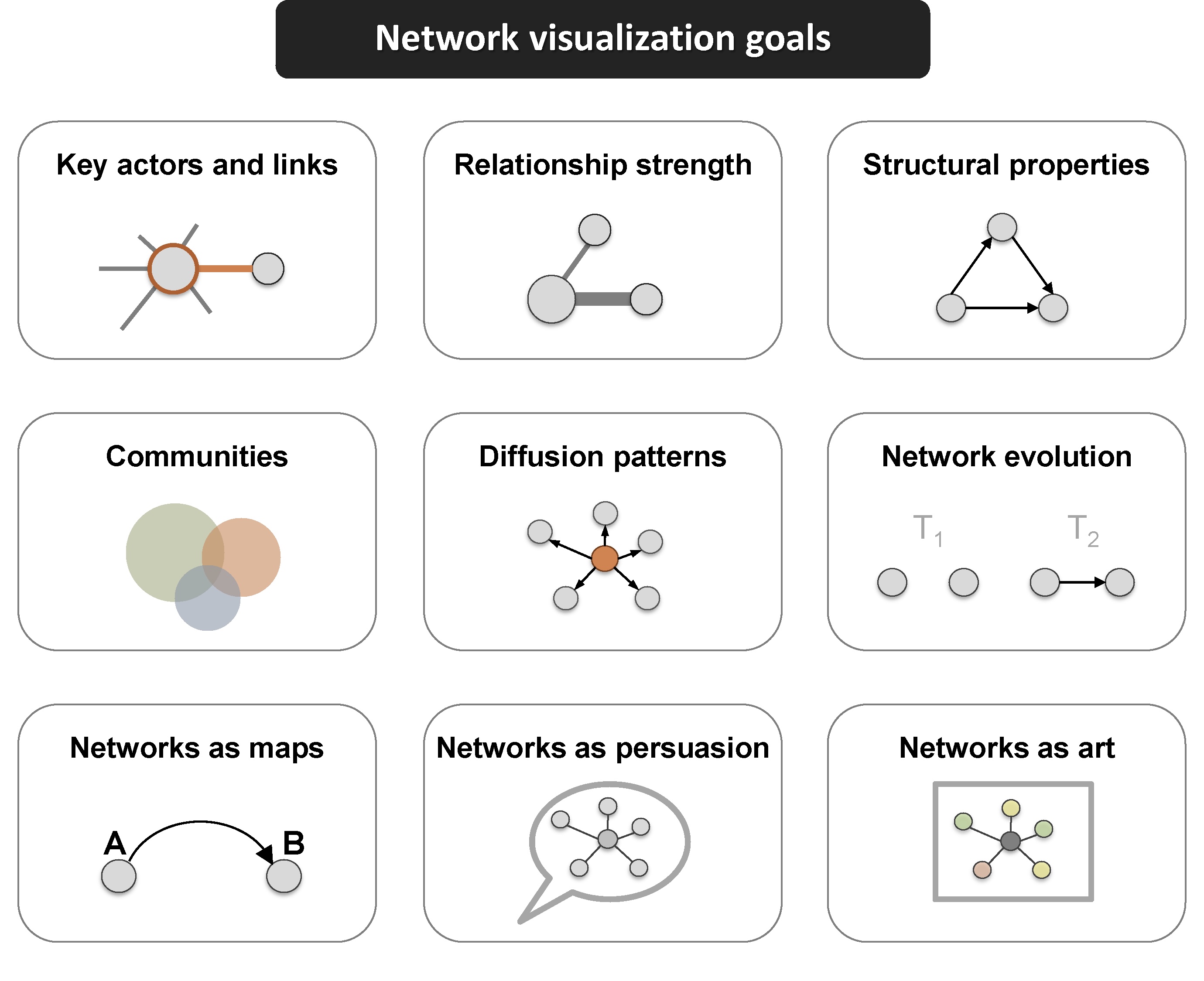
Network visualization can be used for a variety of purposes, ranging from highlighting key actors to even serving as works of art.
This excellent figure from Katya Ognyanova’s also excellent tutorial on Static and Dynamic Network Visualization with R helps illustrate the variety of goals a good network visualization can accomplish:
In Section 3 work focus on just visualization, and will use the {tidygraph} package to create a network sociogram to help visually describe our network and compare teacher and student reported friendships. Specifically, in this section we’ll learn to make a:
Simple Sociogram. We learn about the basic plot() and auto_graph() functions for creating a very quick network plot when just a quick visual inspection is needed.
Sophisticated Sociogram. We then dive deeper in to the ggraph() function and learn to plot nodes and edges in our network and tweak key elements like the size, shape, and position of nodes and edges to better at communicating key findings.
3a. Simple Sociograms
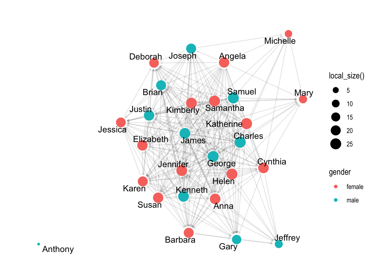
These visual representations of the actors and their relations, i.e. the network, are called a sociogram. Actors who are most central to the network, such as those with higher node degrees, or those with more friends in our case study, are usually placed in the center of the sociogram and their ties are placed near them.
The plot() function from R’s built in {graphics} package can be used to make a wide range of graphs, including sociograms, but as you’ll see it’s a bit lacking and is limited limited in the level of customization allowed.
In the code chunk below, use the plot() function with your student_network object to see what the basic plot function produces:
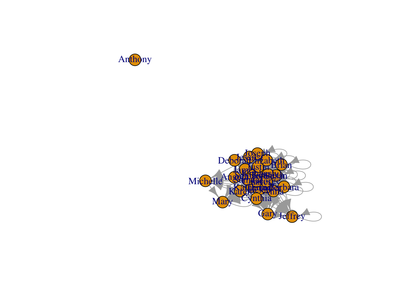
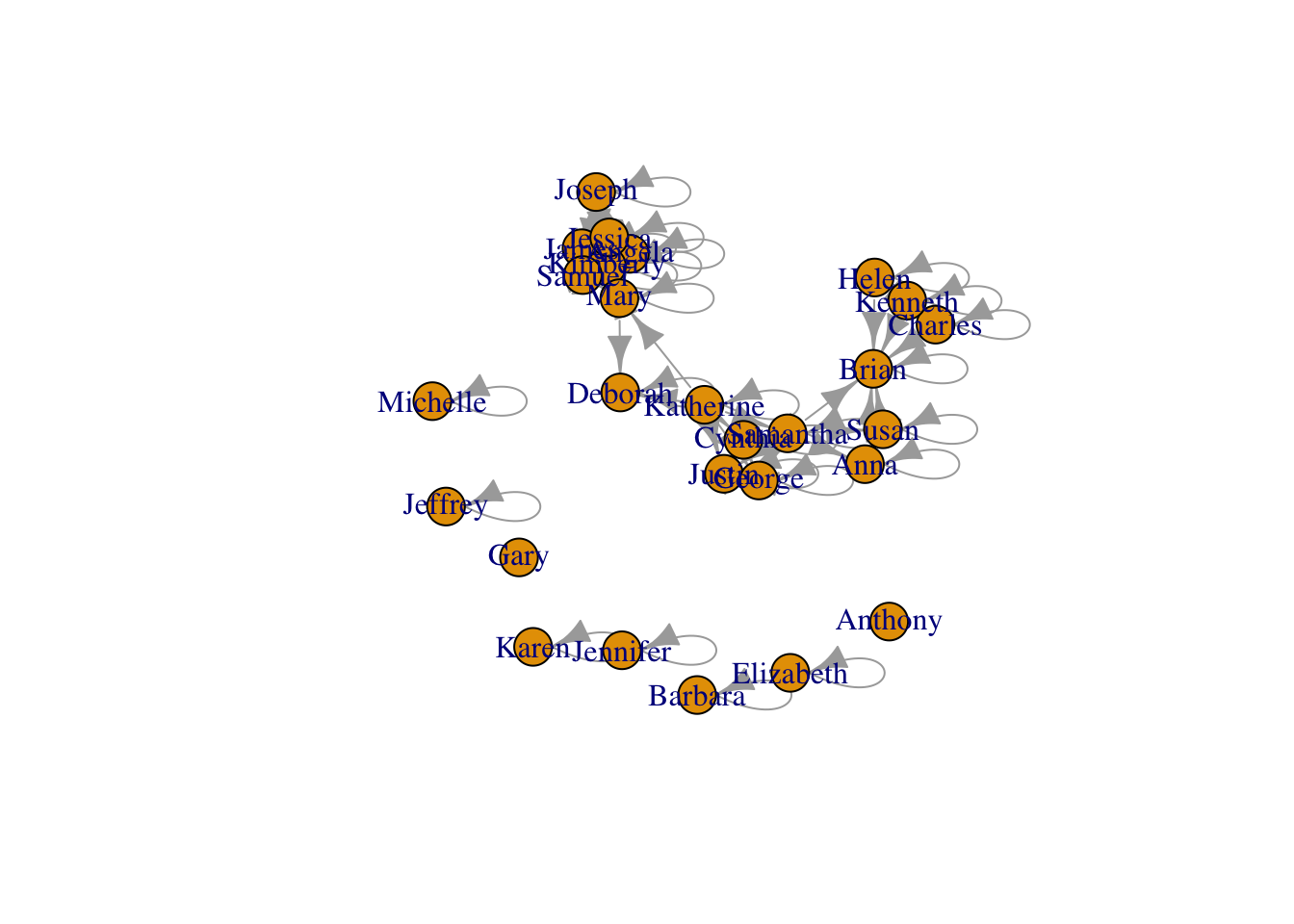
plot(student_network)
Not super great. In fact, it’s visualizations like these that give sociograms the unflattering nickname of “hair ball” plots!
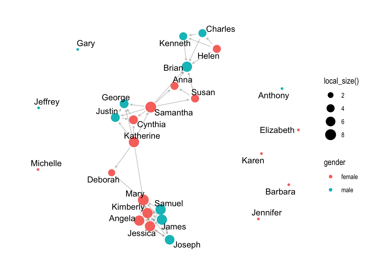
If this had been a smaller network it might have been a little more useful but one important insight is that we have already identified an “isolate” in our network, i.e., student 19 who neither named others as a friend or was named by others as a friend.
Fortunately, the {ggraph} package includes a plethora of plotting parameters for graph layouts, edges and nodes to improve the visual design of network graphs.
Let’s first take a quick look the auto_graph() function for making quick and simple sociograms similar to the R base plotting function above:
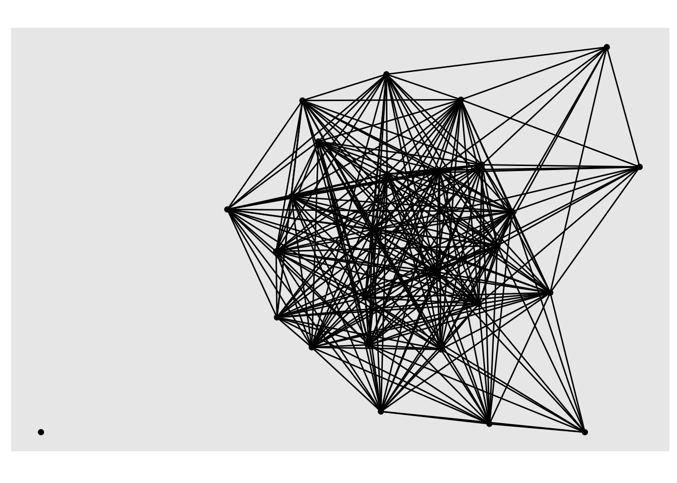
autograph(student_network)
A little better, but also lacking in many important ways. Like the plot() function, it does allow some small degree of customization, but is still rather limited and best use for very quick sociograms to get a quick feel for the data.
Run the following code chunk to see some additional arguments you can add to the autograph() function:
Not exactly great graphs, but they already provided some insight into our research questions. Specifically, we can see visually that teacher and student reported peer networks are very different!
3b. Sophisticated Sociograms
One thing to keep in mind when building a network viz with {ggraph}, is that just like it’s ggplot() counterpart introduced in Foundation Labs, there is a minimal code template for producing a basic plot. Specifically, ggraph requires 3 main functions
ggraph() takes care of setting up the plot object along with creating the layout of the graph (default = “stress”).
geom_node_*() functions and their associated arguments add and modify the nodes of the network plot.
geom_edge_*() functions and their associated arguments add and modify the edgez of the network plot.
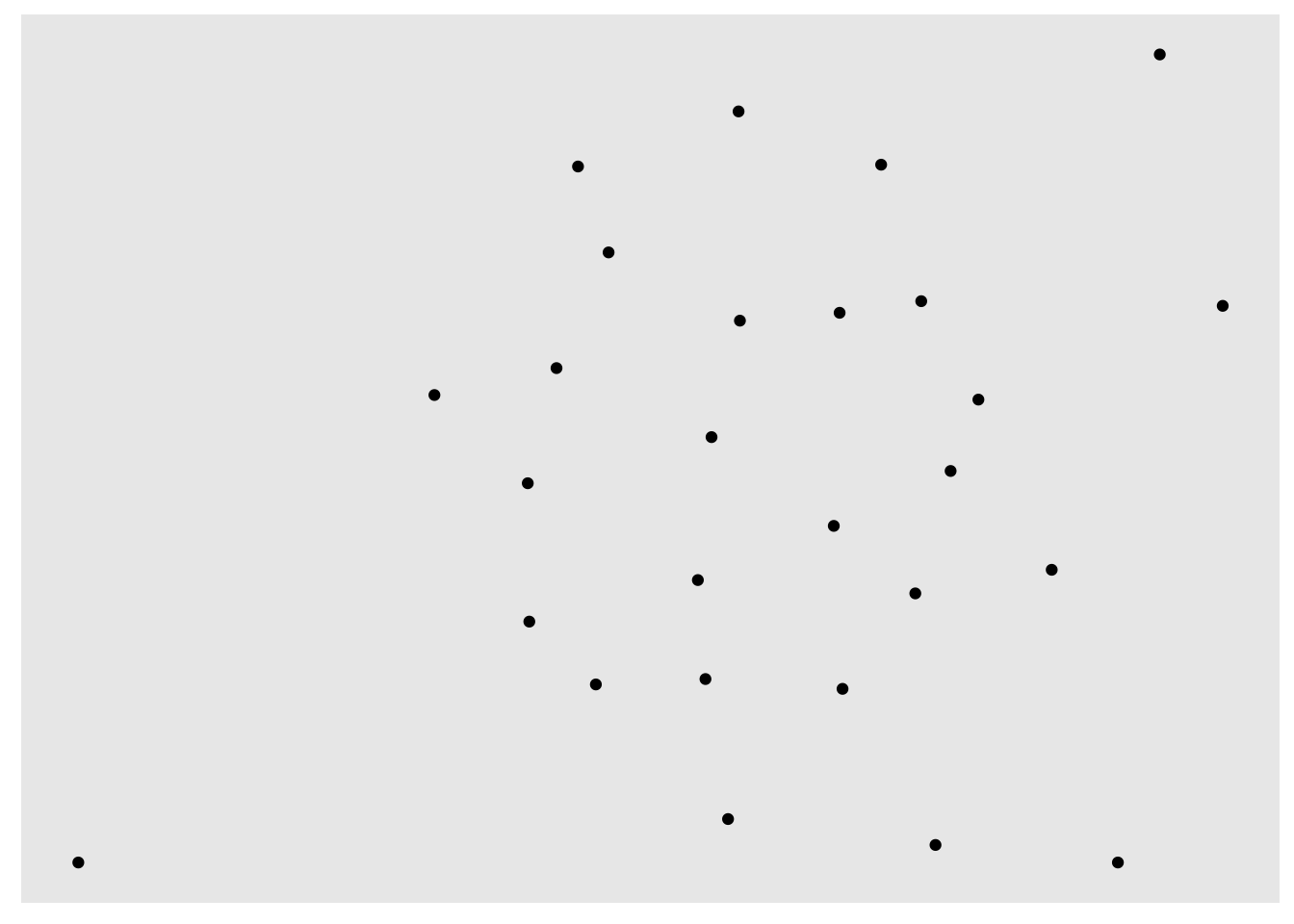
Let’s first pass our student_network object to ggraph() and see what happens.
ggraph(student_network)
Using "stress" as default layout
Wow, that was unimpressive. But don’t worry, just like the ggplot() function, ggraph() doesn’t produce much on it’s own. All that the ggraph() function does is set up the network object based on our student_network, and creates a layout for our sociogram, in this case using the default “stress” layout as indicated by the output.
Add Nodes
Very similar to how ggplot() uses the + operator to “layer” functions together to progressively build more sophisticated graphs, ggraph() uses the + operator progressively build a sociogram.
To add our nodes, we’ll added the geom_node_point() function. Again, just like with {ggplot2}, the “geom” in the geom_non_point() functions stands for “Geometric elements”, or geoms for short, and represents what you actually see in the plot.
👉 Your Turn ⤵
Now “add” the geom_node_point() function to our code using the + operator:
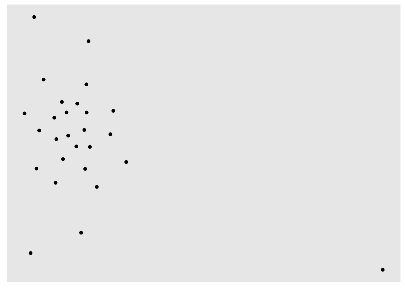
ggraph(student_network) +geom_node_point()
Using "stress" as default layout
Well, at least we have our nodes now!
Add Layout
One of the major advances in visualization since the first hand-drawn sociograms developed by Jacob Moreno (1934) to represent relations among children in school is the use of software and algorithms to automatically layout networks on a grid.
There are may different layout methods, but we’ll start with the Fruchterman-Reingold (FR) layout, which is one of the most widely used layout algorithms for network visualization. These types of force-directed algorithms generally work well with large networks and try to layout graphs in “an aesthetically-pleasing way” by making edges roughly equal in length and minimizing overlap.
Let’s go ahead and include the layout argument, which in addition to including its own unique layouts, can incorporate layouts form {igraph} package like fr for the Fruchterman-Reingold (FR) layout:
That’s not much better so let’s stick with the “stress” layout for now. Feel free to try out some other ggraph layout methods if you like, however. There are also
Tweak Nodes
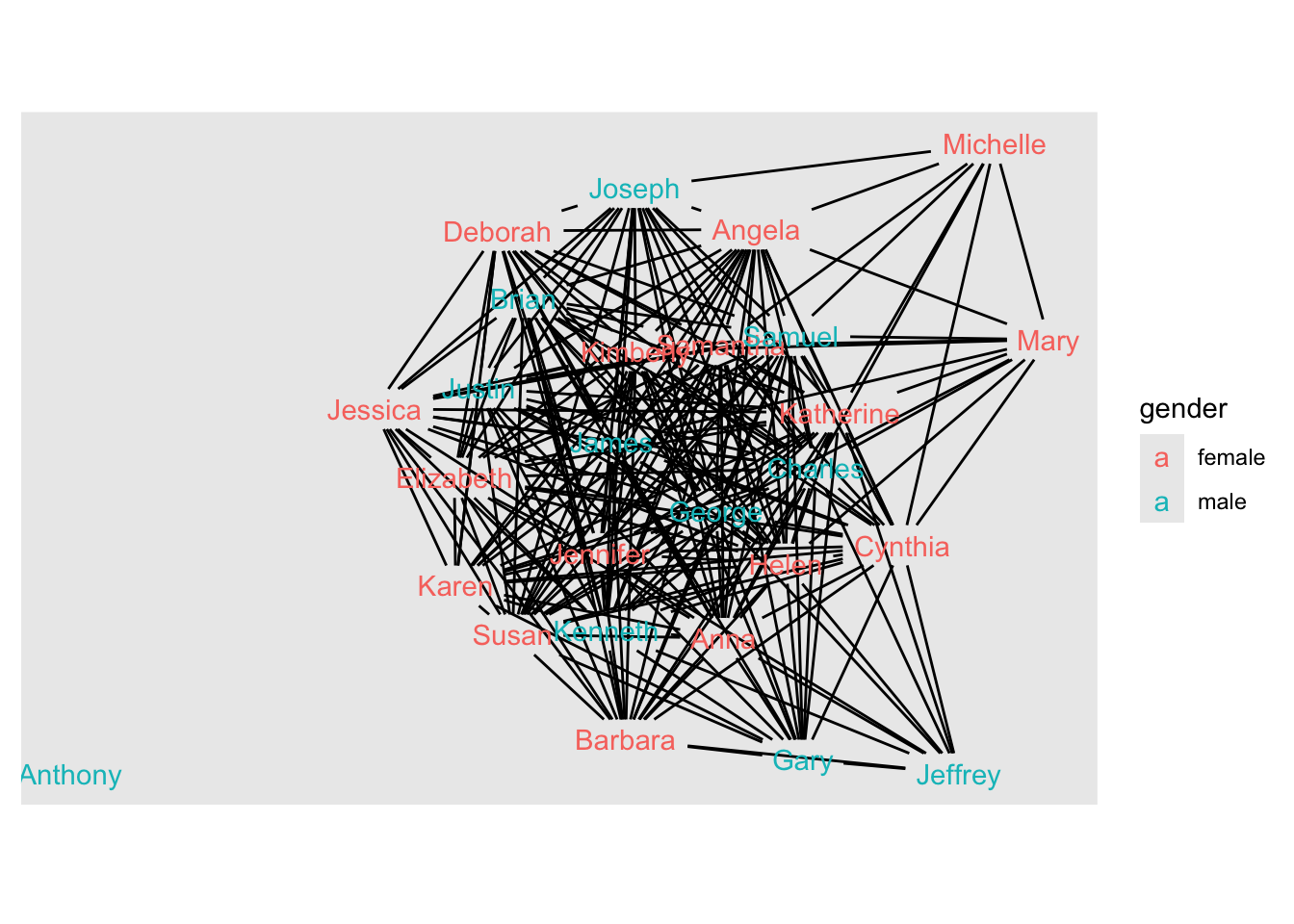
Also like {ggplot2}, geoms can include aesthetics, or aes for short, such as alpha for transparency, as well as color, shape and size.
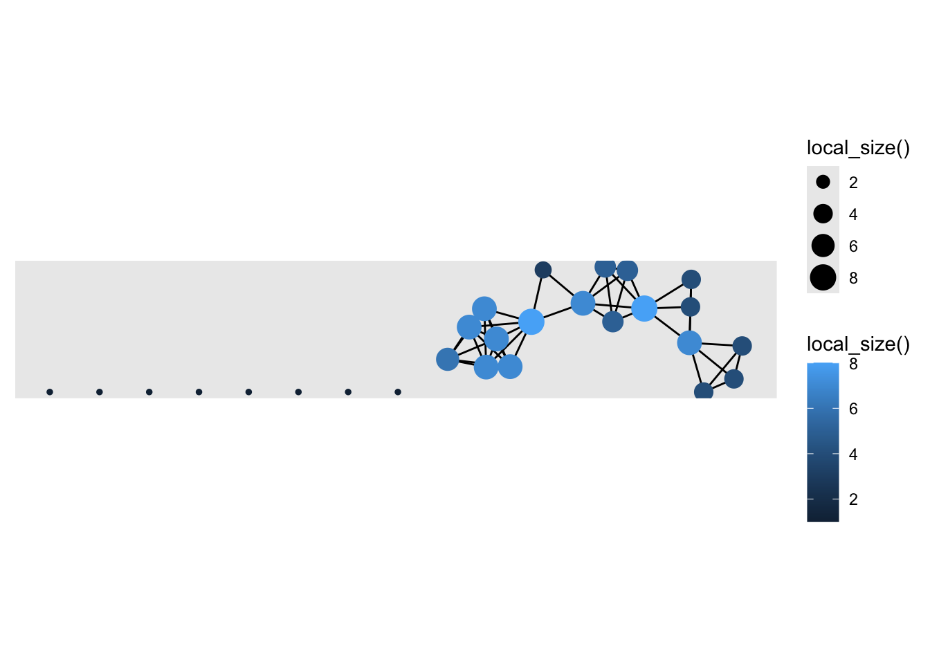
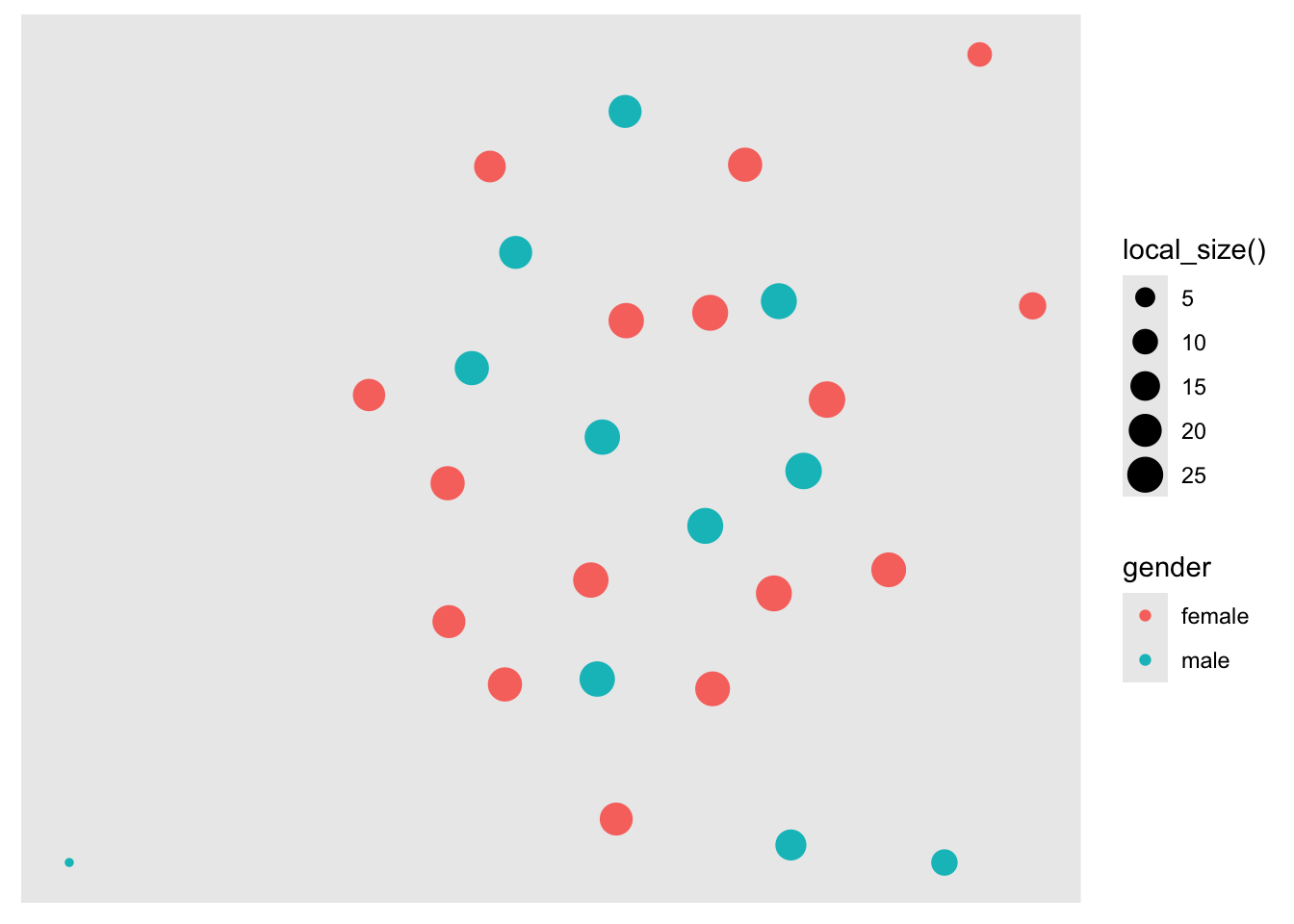
Let’s now add some “aesthetics” to our points by including the aes() function and arguments such as size = and color =. We’ll use our gender variable for color and set the size of the node using local_size() function, which will base the size of each node on the number of friends each student nominated.
We can easily see that the number of friends ranges from 5 to 20, with the exception of one “isolated” student we identified earlier who is not connected to any other students in the network, and therefore is smaller in size on the graph.
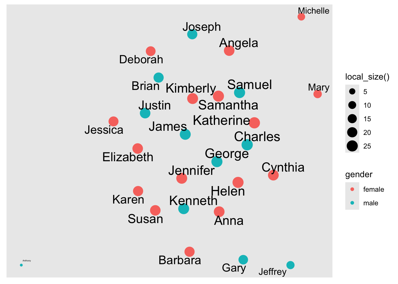
Let’s fix that by adding another layer with some node text and labels. Since node labels are a geometric element, we can apply aesthetics to them as well, like color and size. Let’s also include the repel = argument that when set to TRUE will avoid overlapping text.
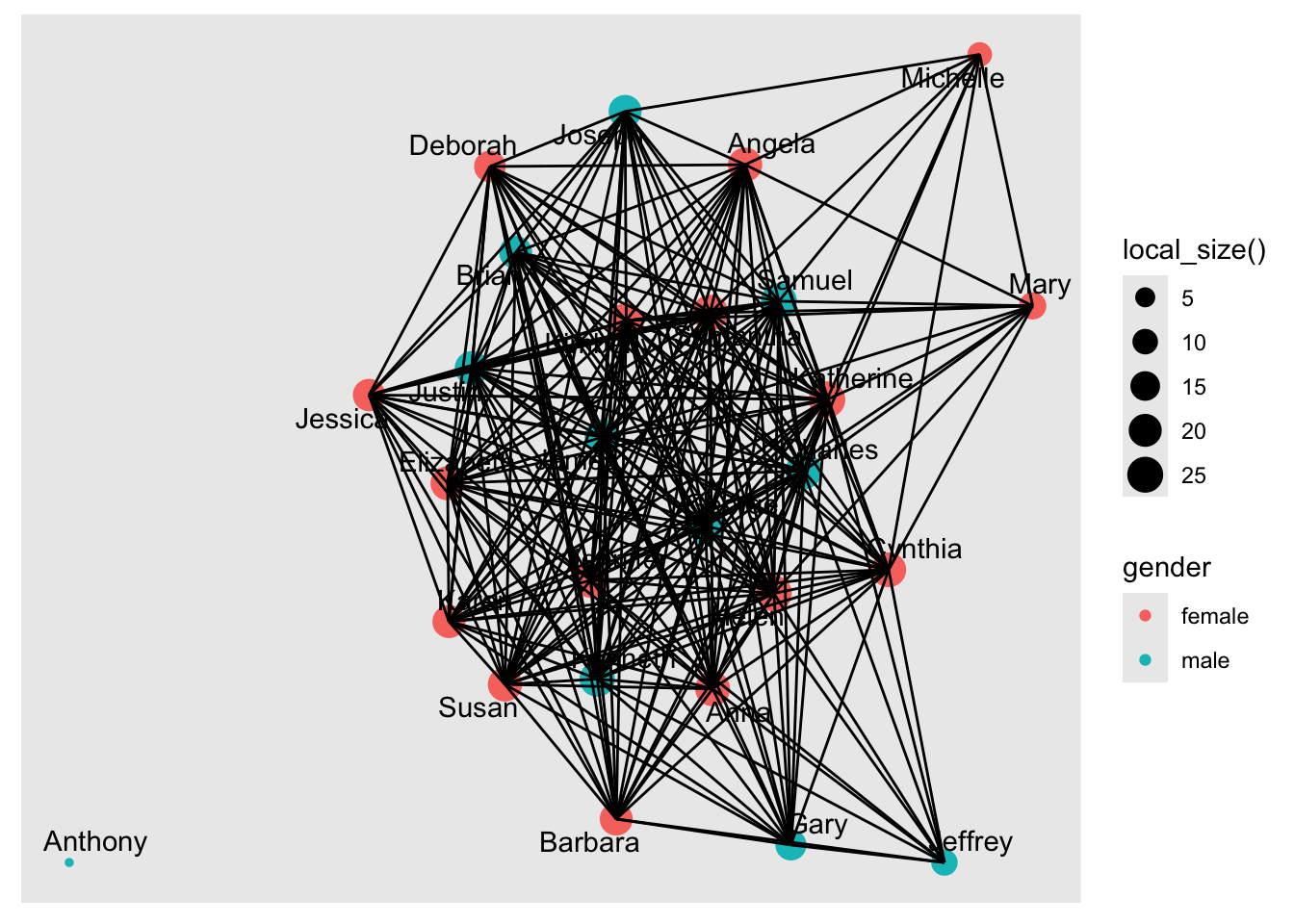
Ack! Without some adjustment, the edges make it really difficult to see the nodes. Fortunately, you can also adjust the edges just like we did to the nodes above: Let’s now include the following arguments:
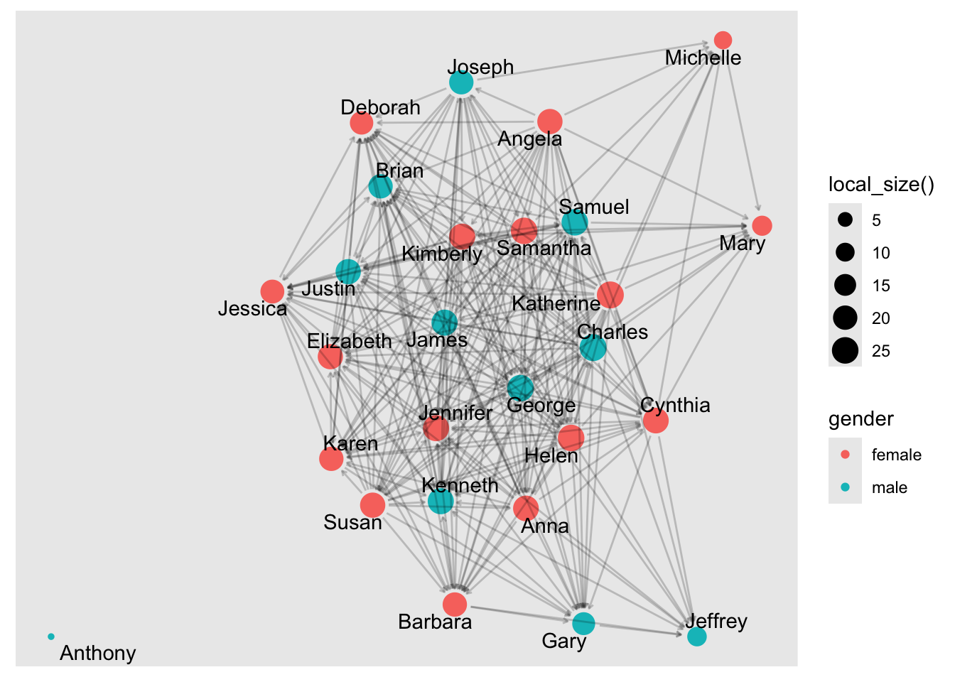
arrow = to include some arrows 1mm in length
end_cap = and start_cap = to keep arrows from overlapping the nodes, and to
alpha = .2 set the transparency of our edges so our edges fade more into the background and help keep the focus on our nodes:
Finally, let’s add a theme, which controls the finer points of display, like the font size and background color. The theme_graph() function add a theme specially tuned for graph visualizations. This function removes redundant elements in order to put focus on the data and if you type ?theme_graph in the console you will get a sense of the level of fine tuning you can do if desired.
Let’s add theme_graph() to our sociogram, remove the legends since they are not especially useful, and call it good for now:
Much better! Notice also how we shifted the geom_node_point() layer of our graph to after the geom_edge_link() so the parts of nodes would not be hidden under the edges.
Note: If you’re having difficulty seeing the sociogram in the small R Markdown code chunk, you can copy and paste the code in the console and it will show in the Viewer pan and then you can enlarge and even save as an image file.
👉 Your Turn ⤵
Now that you have a sense of how the {ggraph} package works to build network graphs, use the code chunk below and try building sophisticated sociogram for the teacher_network object that you created above.
There are no right or wrong answers, just have some fun trying out different options for graph layouts, edges and nodes and see if you can build something that is visually pleasing to you.
Congrats, you made it to the end of the EXPLORE section and created your first sociogram in R!
4. MODEL
As highlighted in Chapter 3 of Data Science in Education Using R, the Model step of the data science process entails “using statistical models, from simple to complex, to understand trends and patterns in the data.” We will not explore the use of models for SNA until Module 4, but recall from the PREPARE section that to assess agreement between perceived friendships by the teacher and students, (Pittinsky and Carolan 2008) note that:
The QAP (quadratic assignment procedure) [is] used to calculate the degree of association between two sets of relations and tests whether the probability of dyad overlap in the teacher matrix is correlated with the probability of dyad overlap in the student matrix. It does so by running a large number of simulations. These simulations generate random matrices with sizes and value distributions based on the original two matrices being tested.
We will learn more about the QAP and other models for statistical inference when working with relational data in Learning Lab 4.
5. COMMUNICATE
The final step in the workflow/process is sharing the results of your analysis with wider audience. Krumm et al. Krumm, Means, and Bienkowski (2018) have outlined the following 3-step process for communicating with education stakeholders findings from an analysis:
Select. Communicating what one has learned involves selecting among those analyses that are most important and most useful to an intended audience, as well as selecting a form for displaying that information, such as a graph or table in static or interactive form, i.e. a “data product.”
Polish. After creating initial versions of data products, research teams often spend time refining or polishing them, by adding or editing titles, labels, and notations and by working with colors and shapes to highlight key points.
Narrate. Writing a narrative to accompany the data products involves, at a minimum, pairing a data product with its related research question, describing how best to interpret the data product, and explaining the ways in which the data product helps answer the research question and might be used to inform new analyses or a “change idea” for improving student learning.
Render File
For your SNA Badge, you will have an opportunity to create a simple “data product” designed to illustrate some insights gained from your analysis and ideally highlight an action step or change idea that can be used to improve learning or the contexts in which learning occurs.
For now, we will wrap up this case study by converting your work to an HTML file that can be published and used to communicate your learning and demonstrate some of your new R skills. To do so, you will need to “render” your document by clicking the Render button in the menu bar at that the top of this file.
Rendering a document does two important things:
checks through all your code for any errors; and,
creates a file in your directory that you can use to share you work .
👉 Your Turn ⤵
Now that you’ve finished your first case study, click the “Render” button in the toolbar at the top of your document to covert this Quarto document to a HTML web page, just one of the many publishing formats you can create with Quarto documents.
If the files rendered correctly, you should now see a new file named sna-1-case-study-R.html in the Files tab located in the bottom right corner of R Studio. If so, congratulations, you just completed the getting started activity! You’re now ready for the unit Case Studies that we will complete during the third week of each unit.
Important
If you encounter errors when you try to render, first check the case study answer key located in the files pane and has the suggested code for the Your Turns. If you are still having difficulties, try copying and pasting the error into Google or ChatGPT to see if you can resolve the issue. Finally, contact your instructor to debug the code together if you’re still having issues.
Publish File
There are a wide variety of ways to publish documents, presentations, and websites created using Quarto. Since content rendered with Quarto uses standard formats (HTML, PDFs, MS Word, etc.) it can be published anywhere. Additionally, there is a quarto publish command available for easy publishing to various popular services such as Quarto Pub, Posit Cloud, RPubs , GitHub Pages, or other services.
👉 Your Turn ⤵
Choose of of the following methods described below for publishing your completed case study.
Publishing with Quarto Pub
Quarto Pub is a free publishing service for content created with Quarto. Quarto Pub is ideal for blogs, course or project websites, books, reports, presentations, and personal hobby sites.
It’s important to note that all documents and sites published to Quarto Pub are publicly visible. You should only publish content you wish to share publicly.
To publish to Quarto Pub, you will use the quarto publish command to publish content rendered on your local machine or via Posit Cloud.
Before attempting your first publish, be sure that you have created a free Quarto Pub account.
The quarto publish command provides a very straightforward way to publish documents to Quarto Pub.
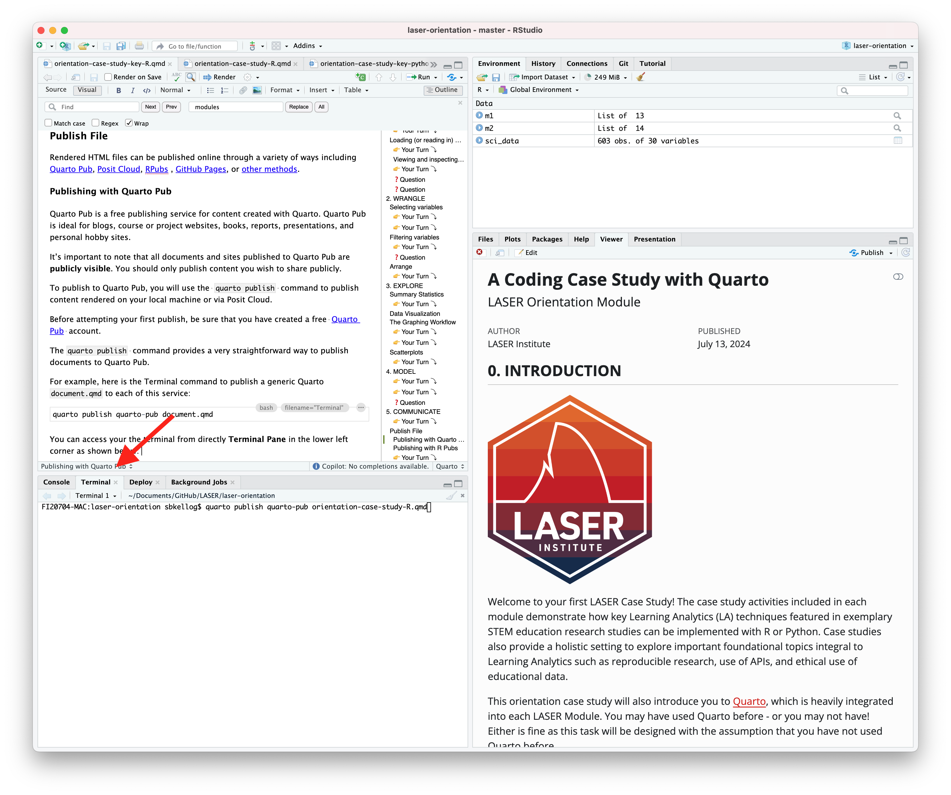
For example, here is the Terminal command to publish a generic Quarto document.qmd to each of this service:
Terminal
quarto publish quarto-pub document.qmd
You can access your the terminal from directly Terminal Pane in the lower left corner as shown below:
The actual command you will enter into your terminal to publish your orientation case study is:
quarto publish quarto-pub sna-2-case-study-R.qmd
When you publish to Quarto Pub using quarto publish an access token is used to grant permission for publishing to your account. The first time you publish to Quarto Pub the Quarto CLI will automatically launch a browser to authorize one as shown below.
Terminal
$ quarto publish quarto-pub? Authorize (Y/n)›❯ In order to publish to Quarto Pub you need toauthorize your account. Please be sure you arelogged into the correct Quarto Pub account in your default web browser, then press Enter or 'Y' to authorize.
Authorization will launch your default web browser to confirm that you want to allow publishing from Quarto CLI. An access token will be generated and saved locally by the Quarto CLI.
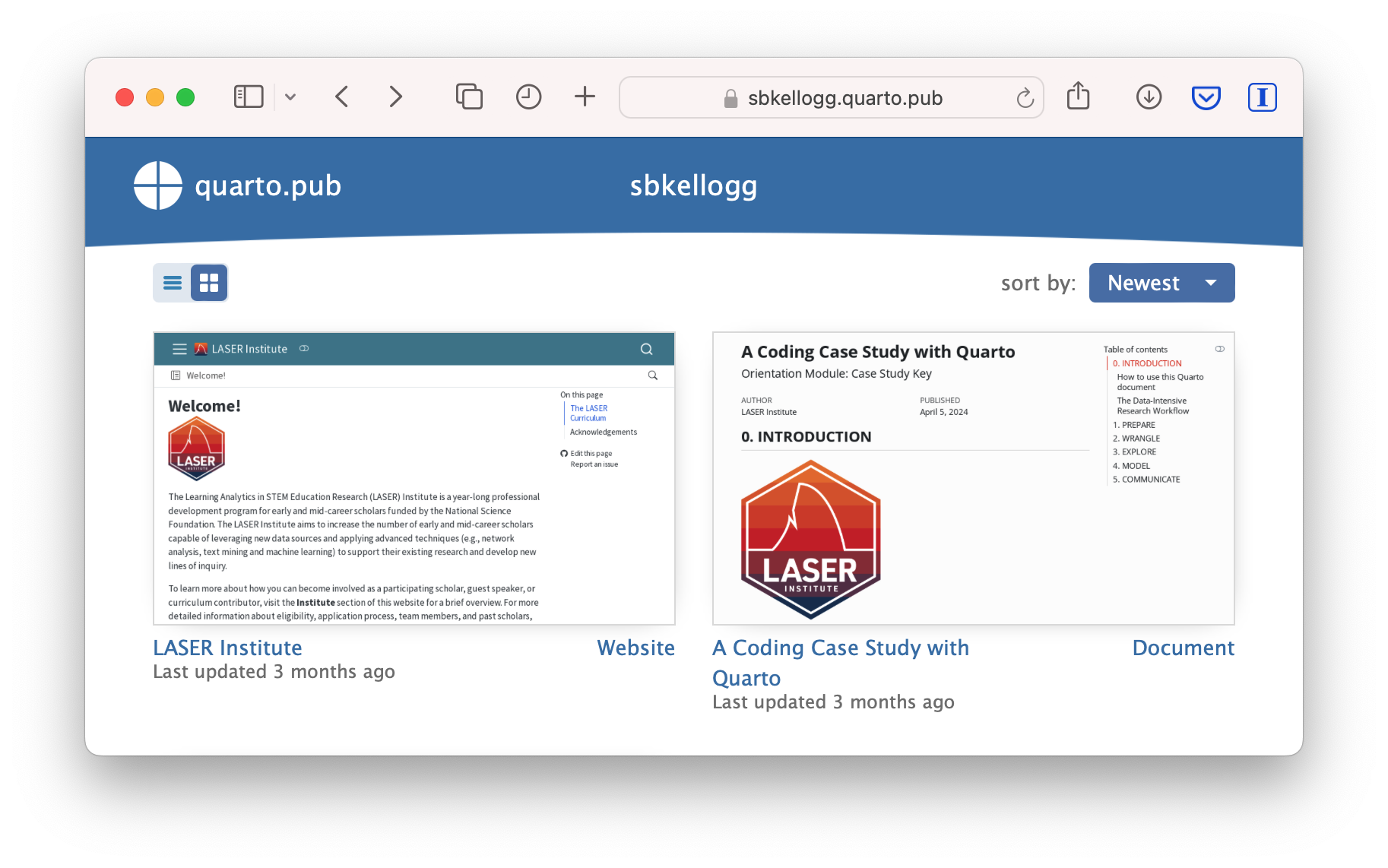
Once you’ve authorized Quarto Pub and published your case study, it should take you immediately to the published document. See my example Orientation Case Study complete with answer key here: https://sbkellogg.quarto.pub/laser-orientation-case-study-key.
After you’ve published your first document, you can continue adding more documents, slides, books and even publish entire websites!
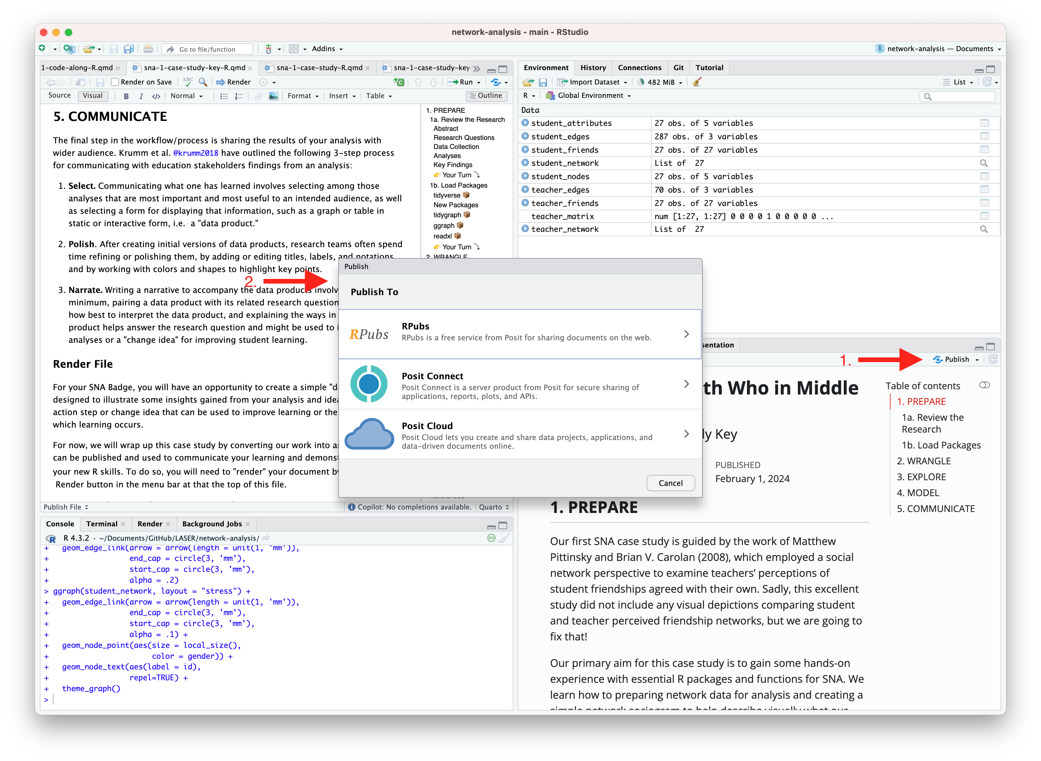
Publishing with R Pubs
An alternative, and perhaps the easiest way to quickly publish your file online is to publish directly from RStudio using Posit Cloud or RPubs. You can do so by clicking the “Publish” button located in the Viewer Pane after you render your document and as illustrated in the screenshot below.
Similar to Quarto Pub, be sure that you have created a free Posit Cloud or R Pub account before attempting your first publish. You may also need to add your Posit Cloud or R Pub account before being able to publish.
Congratulations, you’ve completed the case study! If you’ve already completed the Essential Readings, you’re now ready to earn your first SNA LASER Badge!
Estrellado, Ryan A., Emily A. Freer, Jesse Mostipak, Joshua M. Rosenberg, and Isabella C. Velásquez. 2020. Data Science in Education Using r. Routledge. https://doi.org/10.4324/9780367822842.
Pittinsky, Matthew, and Brian V Carolan. 2008. “Behavioral Versus Cognitive Classroom Friendship Networks: Do Teacher Perceptions Agree with Student Reports?”Social Psychology of Education 11: 133–47. https://link.springer.com/content/pdf/10.1007/s11218-007-9046-7.pdf.
Wickham, Hadley, and Garrett Grolemund. 2016. R for Data Science: Import, Tidy, Transform, Visualize, and Model Data. " O’Reilly Media, Inc.". https://r4ds.had.co.nz.


 Render button in the menu bar at that the top of this file.