The Data-Intensive Research Workflow
Orientation Module: Code-Along
Overview

Data-Intensive Research Workflow (Krumm, Means, and Bienkowski 2018)
Prepare
The setting of this study was a public provider of individual online courses in a Midwestern state.
Data was collected from two semesters of five online science courses and aimed to understand students motivation.
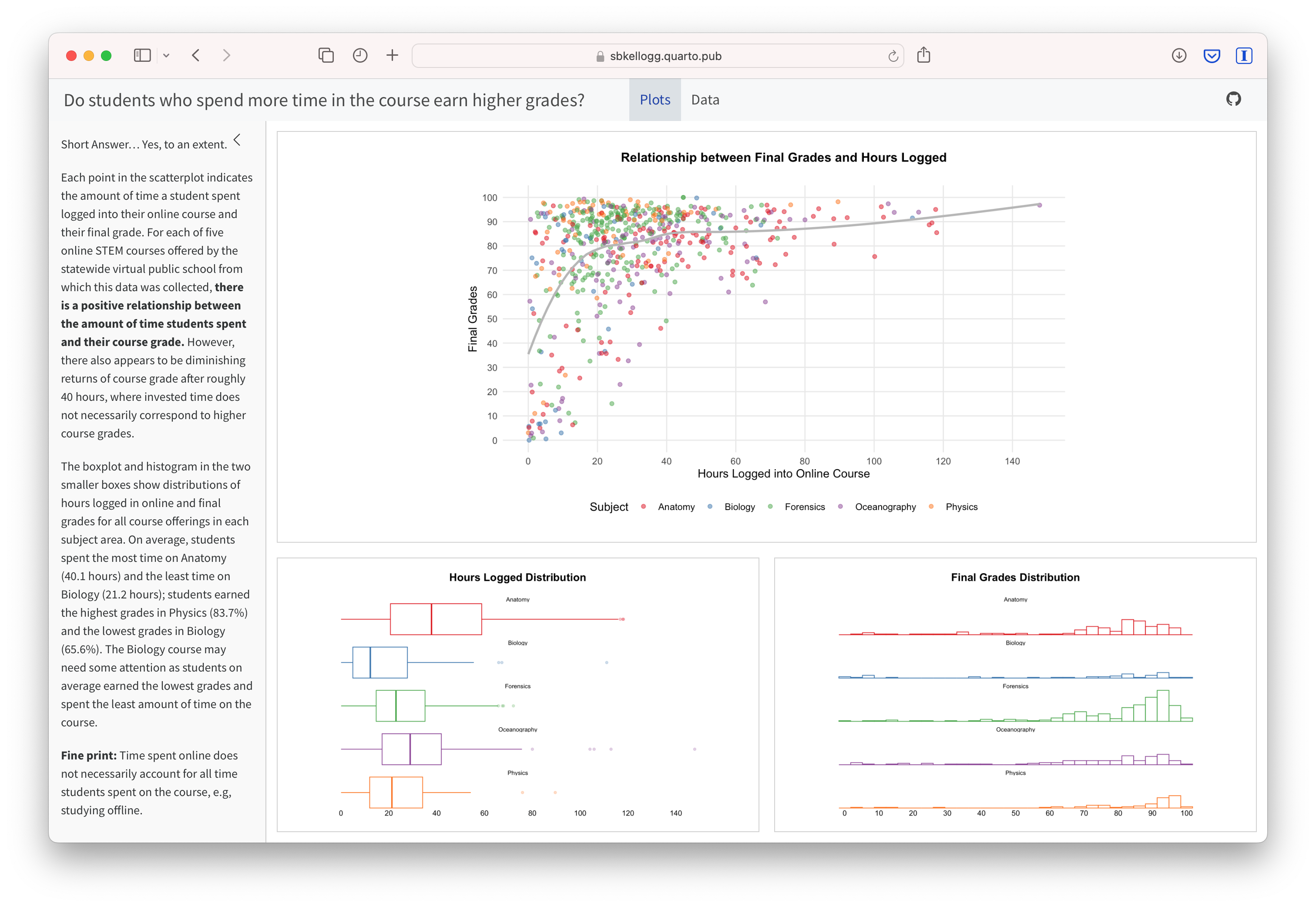
Is there a relationship between the time students spend in a learning management system and their final course grade?
The data used in this case study has already been “wrangled” quite a bit, but the original datasets included:
A self-report survey assessing three aspects of students’ motivation
Log-trace data from the learning management system (LMS) including discussion board posts
Administrative records including academic achievement and student demographic data
Sometimes referred to as “libraries”, packages are shareable collections of R code that can contain functions, data, and/or documentation.
Wrangle
Data wrangling is the process of cleaning, “tidying”, and transforming data. In Learning Analytics, it often involves merging (or joining) data from multiple sources.
The {readr} tidyverse package has several functions like read_csv() for importing rectangular data from delimited text files such as comma-separated values (CSV), a preferred file format for reproducible research.
R has also packages for proprietary data formats like .xls, .sas, and .dat.
You should now see a new data “object” named sci_data saved in your Environment pane. Try clicking on it and see what happens!
Now let’s “print” the output to our Console to view another way:
What variables do you think might help us answer our research question?
Since we are interested the relationship between time spent in an online course and final grades, let’s select() the FinalGradeCEMS and TimeSpent from sci_data.
Note the use of a the powerful |> operator called a pipe, which are used for combining a sequence of functions or processes.
The R language can express complex ideas like in this simple “sentence”:
sci_data <- read_csv("data/sci-online-classes.csv", col_names = TRUE)
- Functions are like verbs:
read_csv() - Objects are the nouns:
read_csv("data/sci-online-classes.csv") - Arguments are like adverbs:
read_csv("data/sci-online-classes.csv", col_names = TRUE) - Operators are like “punctuation”
sci_data <- read_csv("data/sci-online-classes.csv", col_names = TRUE)
Explore
Exploratory data analysis involves processes of describing your data numerically or graphically and often involves:
calculating summary statistics like frequency, means and standard deviations
visualizing your data through charts and graphs
EDA can be used to help answer research questions or generate new questions about your data, discover relationships between and among variables, and create new variables for data modeling.
The {ggplot2} package follows a common graphing workflow for making graphs. To make a graph, you simply:
- Start the graph with
ggplot()function and include your data as an argument; - “Add” elements to the graph using the
+operatora geom_()function; - Select variables to graph on each axis with the
aes()argument.
A common graphing template is as simple as two lines of code:
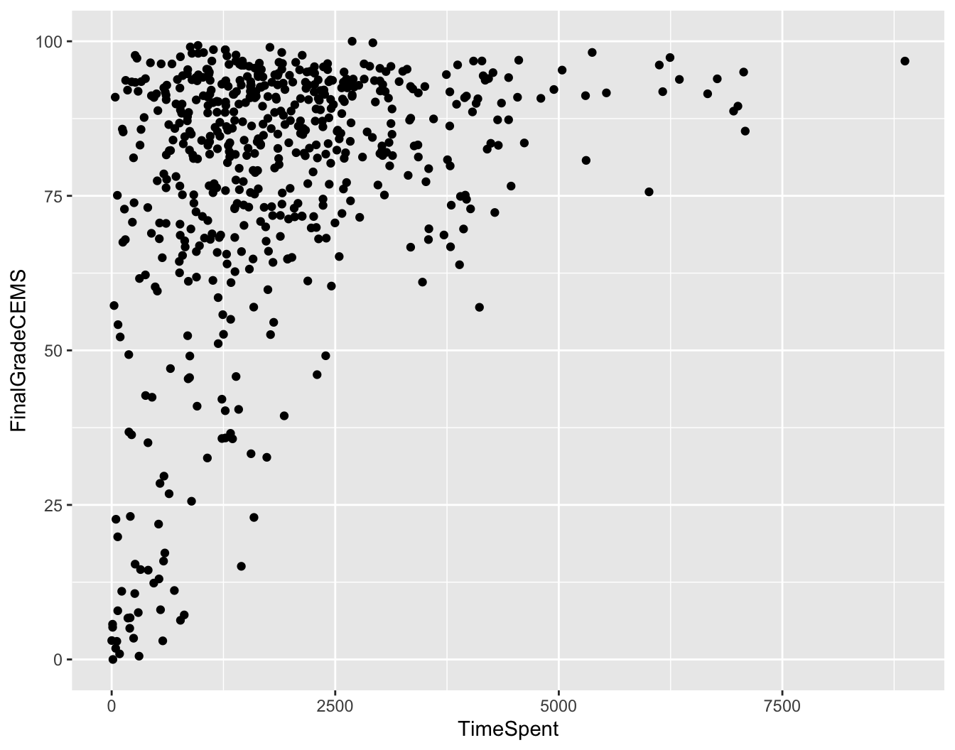
Scatterplots use the point geom, i.e., the geom_point() function, and are most useful for displaying the relationship between two continuous variables.
Hopefully your scatterplot looks like something like the one to the right.
How would you interpret this graph?

Model
According to Krumm, Means, and Bienkowski (2018), there are two general types of approaches:
Unsupervised learning algorithms can be used to understand the structure of one’s dataset.
Supervised models, on the other hand, help to quantify relationships between features and a known outcome.
Ideally, a good model will separate true “signals” (i.e. patterns generated by the phenomenon of interest) from the “noise” (i.e. random variation that you’re not interested in).
We’ll dive much deeper into modeling in subsequent learning labs, but for now let’s see if there is a statistically significant relationship between students’ final grades, FinaGradeCEMS, and the TimeSpent in the LMS:
Call:
lm(formula = FinalGradeCEMS ~ TimeSpent, data = sci_data)

Residuals:
    Min      1Q  Median      3Q     Max
-67.136  -7.805   4.723  14.471  30.317

Coefficients:
             Estimate Std. Error t value Pr(>|t|)
(Intercept) 6.581e+01  1.491e+00   44.13   <2e-16 ***
TimeSpent   6.081e-03  6.482e-04    9.38   <2e-16 ***
---
Signif. codes:  0 '***' 0.001 '**' 0.01 '*' 0.05 '.' 0.1 ' ' 1

Residual standard error: 20.71 on 571 degrees of freedom
  (30 observations deleted due to missingness)
Multiple R-squared:  0.1335,    Adjusted R-squared:  0.132
F-statistic: 87.99 on 1 and 571 DF,  p-value: < 2.2e-16
Our simple model suggests that there is a statistically significant, though relatively small, positive association between the time spent in the LMS and a student’s final grade. However, many other factors not included in the model may be influencing final grades.
Communicate
Krumm et al. (2018) have outlined the following 3-step process for communicating finding with education stakeholders:
Select. Selecting analyses that are most important and useful to an intended audience, as well as selecting a format for displaying that info (e.g. chart, table).
Polish. Refining or polishing data products, by adding or editing titles, labels, and notations and by working with colors and shapes to highlight key points.
Narrate. Writing a narrative pairing a data product with its related research question and describing how best to interpret and use the data product.
What’s Next
Next you will complete an interactive “case study” which is a key component to each LASER Module.
Navigate to the Files tab and open the following file:
orientation-case-study-R.qmd
Acknowledgements

This work was supported by the National Science Foundation grants DRL-2025090 and DRL-2321128 (ECR:BCSER). Any opinions, findings, and conclusions expressed in this material are those of the authors and do not necessarily reflect the views of the National Science Foundation.


