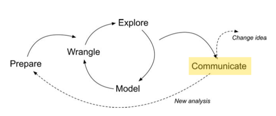
Dashboards are one of the most flexible ways you can communicate findings with R!
Like other data products, they can be coded using R and R Markdown, and knitted using Quarto.
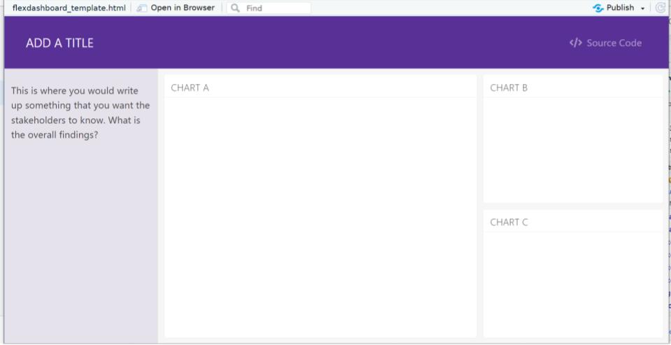
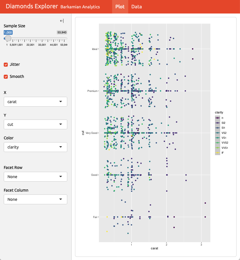
Navigation bar : Icon, title, and author along with links to sub-pages if needed
Pages, rows, & columns : Defined using markdown headings (with optional attributes to control height, width, etc.)
Tabsets : Used to further divide content within a row or column
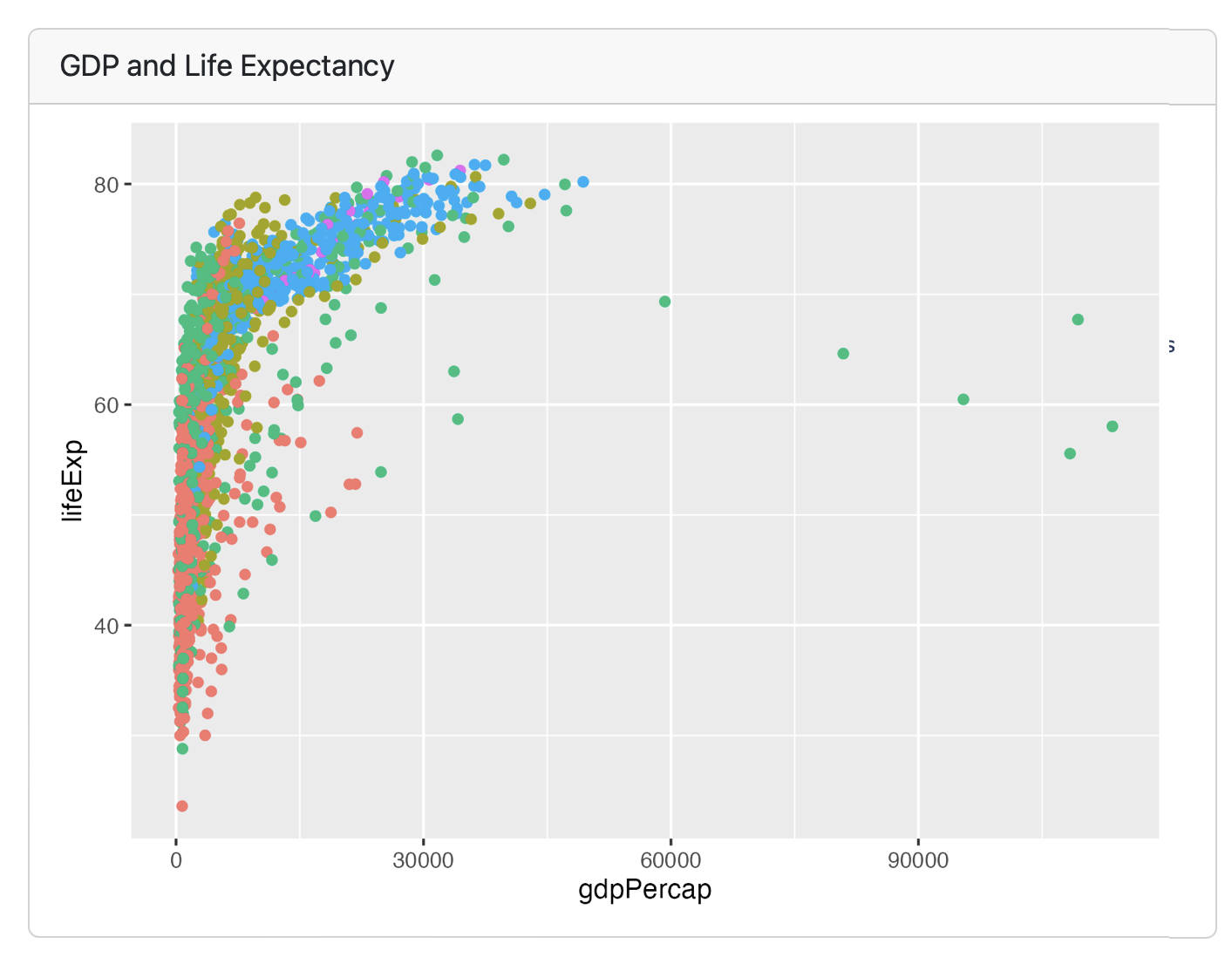
Cards : Containers for plots, data display, and free form content, typically mapped to cells in your notebook or source document
Sidebars and toolbars : Present inputs within interactive dashboards
To make your markdown file a dashboard, use the YAML header to specify “flexdashboard”.
--- : "ADD A TITLE" : :: flex_dashboard: : : 4 : pulse: embed: : paged: : console---