Explore
LAW Module 2: A Code Along
Welcome to the LAW Code Along for Module 2
Exploratory Data Analysis (EDA) for educational researchers involves investigating and summarizing data sets to uncover patterns, spot anomalies, and test hypotheses, using statistical graphics and other data visualization methods.
This process helps researchers understand underlying trends in educational data before applying more complex analytical techniques.

Exploratory Data Analysis
Data Visualization
Data Transformation
Data Preprocessing (DP)
Feature Engineering (FE)

About skimr


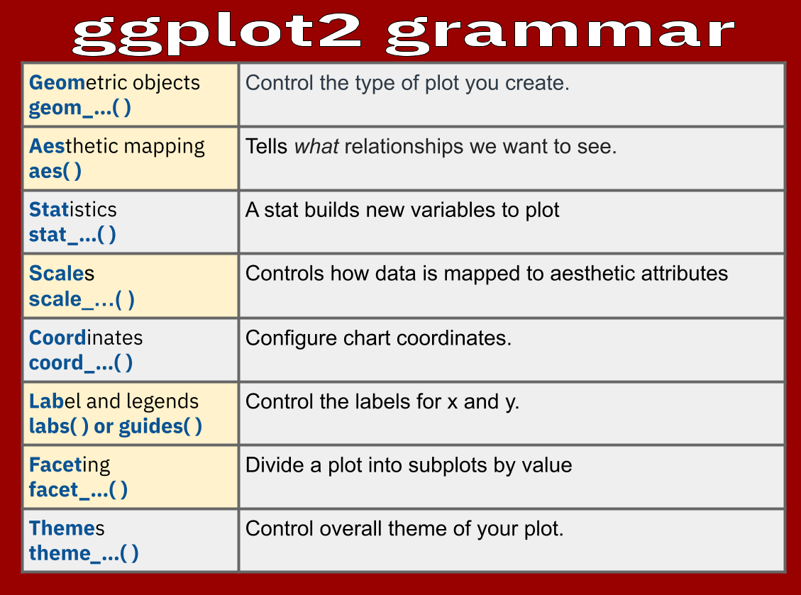
About ggplot2
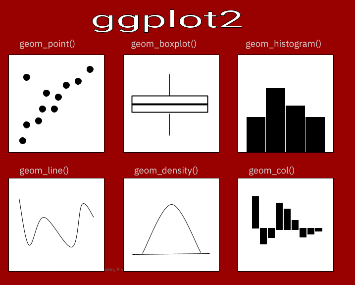


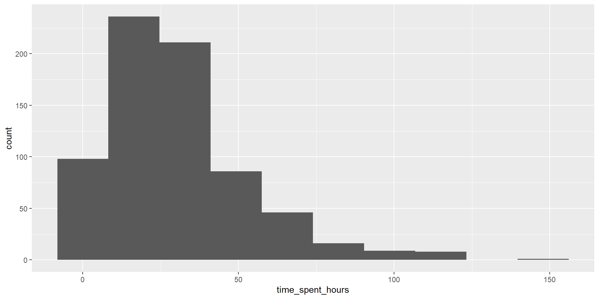
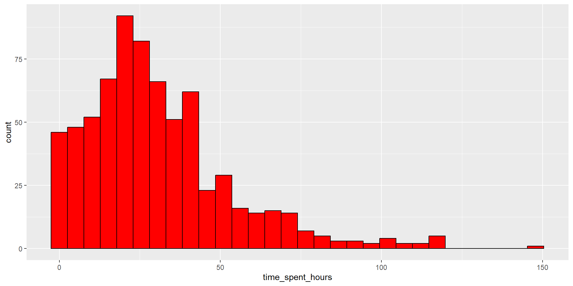
Plotting Histograms
- Load ggplot2
- Write the code for a basic histogram for time_spent_hours

# Layer 1: add data and aesthetic mapping
data_to_explore %>%
  ggplot(aes(x = time_spent_hours)) +
# layer 2: add histogram geom
# layer 3a: add bin size
# layer 3b: add color
  geom_histogram(bins = 30, fill = "red", colour = "black")+
#layer 4: add Labels
  labs(title="Time Spent on LMS histogram plot",x="Time Spent(hours)", y = "Count")+
  theme_classic()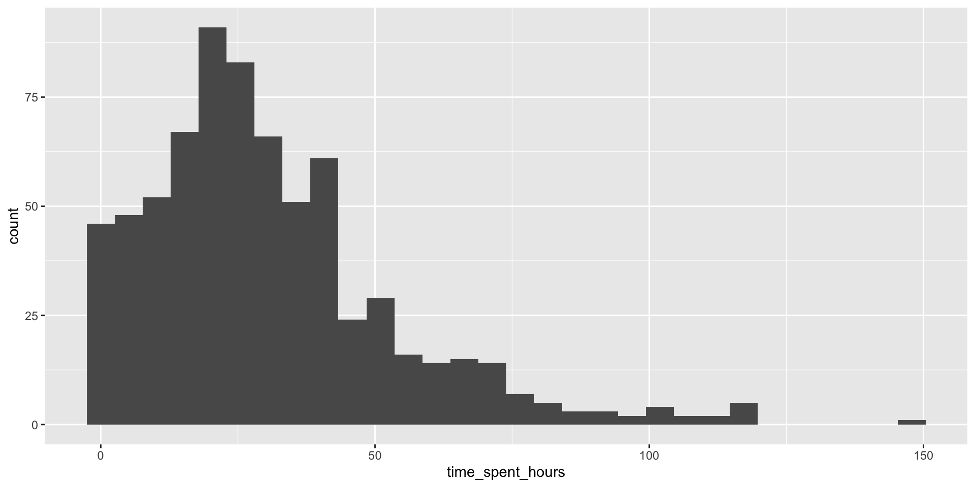
Plotting Scatterplots
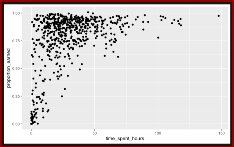
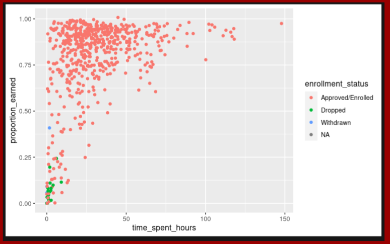
#layer 1: add data and aesthetics mapping
#layer 3: add color scale by type
ggplot(data_to_explore,
       aes(x = time_spent_hours,
           y = proportion_earned,
           color = enrollment_status)) +
#layer 2: +  geom function type
  geom_point() +
#layer 4: add labels
  labs(title="How Time Spent on Course LMS is Related to Points Earned in the Course", #<<
       x="Time Spent (Hours)", #<<
       y = "Proportion of Points Earned")  #<<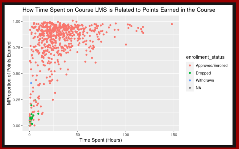
#layer 1: add data and aesthetics mapping
#layer 3: add color scale by type
viz1 <- ggplot(data_to_explore, aes(x = time_spent_hours, y = proportion_earned, color = enrollment_status)) +
#layer 2: + geom function type
geom_point() +
#layer 4: add labels
labs(title="How Time Spent on Course LMS is Related to Points Earned in the Course",
x="Time Spent (Hours)",
y = "Proportion of Points Earned")
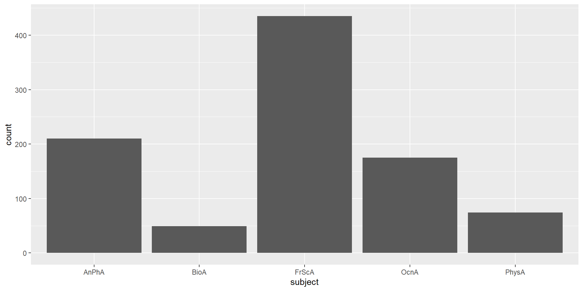
#layer 5: add facet wrap
facet_wrap(~ subject) #<<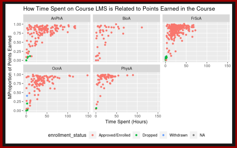
How would you interpret this final graph?