Working with Sentiment Lexicons
Text Mining Module 2: Code Along
Welcome to the Text Mining Code Along for Module 2
The Text Mining course is designed for those seeking an introductory understanding of quantifying the text in documents to better understand their properties
The following Code Along is a companion to the Module 2 Case Study’s Explore stages
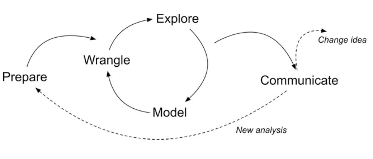
Figure 2.2 Steps of Data-Intensive Research Workflow
[@krumm2018]
Context of the Problem
Rosenberg, J. M., Borchers, C., Dyer, E. B., Anderson, D., & Fischer, C. (2021). Understanding Public Sentiment About Educational Reforms: The Next Generation Science Standards on Twitter. AERA Open, 7. https://doi.org/10.1177/23328584211024261
Research Questions:
What is the public sentiment expressed toward the NGSS?
How does sentiment for NGSS compare to sentiment for CCSS?
Load Libraries

- Load the
tidyverse,tidytext, andtextdatapackages usinglibrary()
Time Series
Let’s take a very quick look at the number of daily tweets over the first 5 months of 2020:
daily_tweets <- ss_tweets |>
  mutate(tweet_date = as.Date(created_at)) |>
  group_by(tweet_date) |>
  summarise(count = n())
# Plot a line chart of the number of tweets over time
ggplot(daily_tweets, aes(x = tweet_date, y = count)) +
  geom_line(color = "#CC0000") +
  labs(
    title = "Number of Tweets Over Time",
    x = "2020",
    y = "Tweet Count")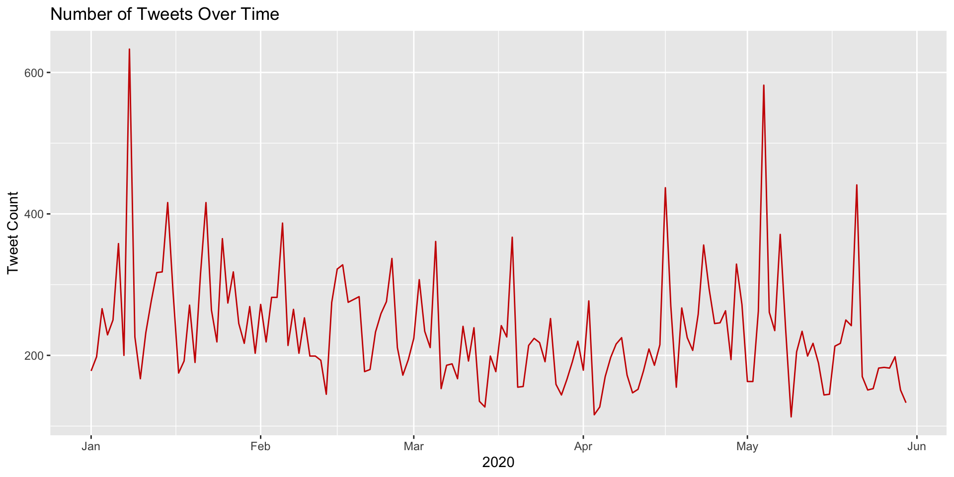
Now recycle and modify the previous code to plot each standard separately so we can compare the number of tweets over time by Next Generation Science and Common Core Standard:
daily_tweets <- ss_tweets |>
  mutate(tweet_date = as.Date(created_at)) |>
  group_by(standards, tweet_date) |>
  summarise(count = n()) |>
  ungroup()

ggplot(daily_tweets, aes(x = tweet_date, y = count, color = standards, group = standards)) +
  geom_line(size = 1) +
  # Manually define colors for each standard
  scale_color_manual(values = c("steelblue", "#CC0000")) +
  labs(
    title = "Number of Tweets Over Time",
    x = "2020",
    y = "Tweet Count",
    color = "Standard"
  ) +
  theme(legend.position = "top")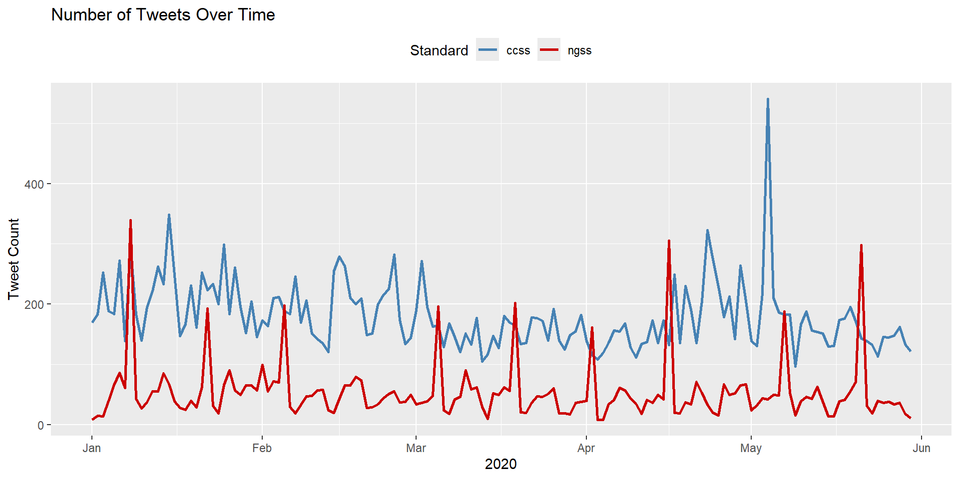
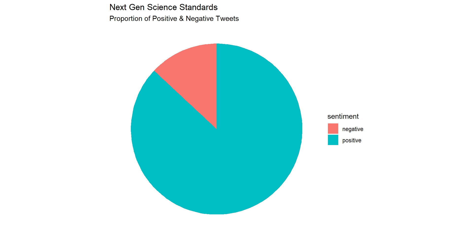
Visualizing Sentiment
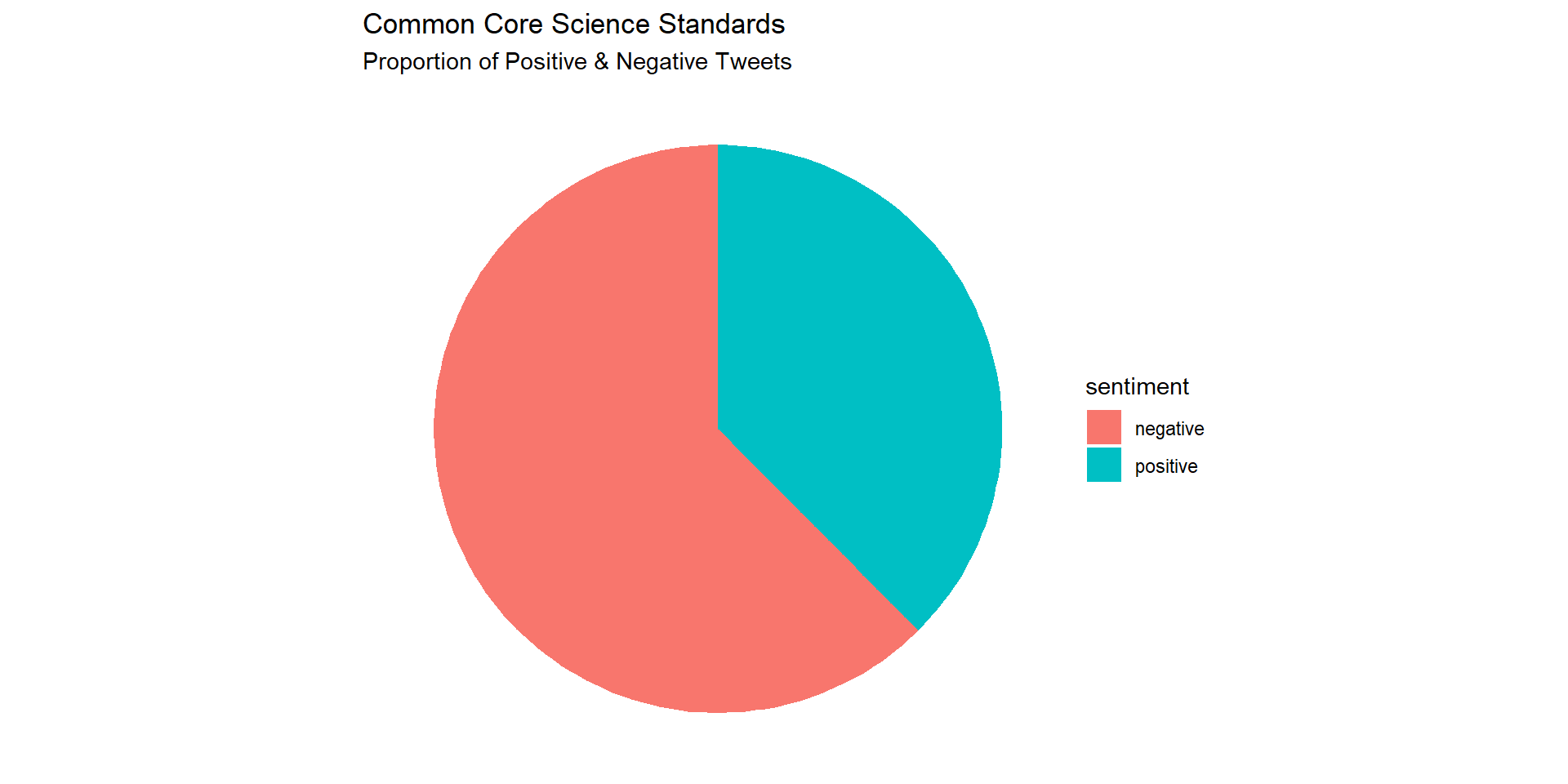
Let’s create a simple pie chart that we can use to visually communicate the proportion of positive and negative tweets:
Replicate this process to create a similar pie chart for the CCSS tweets.
afinn_counts <- afinn_sentiment |>
  group_by(standards) |>
  count(sentiment) |>
  filter(standards == "ccss")

afinn_counts |>
ggplot(aes(x="", y=n, fill=sentiment)) +
  geom_bar(width = .6, stat = "identity") +
  labs(title = "Common Core Science Standards",
       subtitle = "Proportion of Positive & Negative Tweets") +
  coord_polar(theta = "y") +
  theme_void()